Submitted over 2 years agoA solution to the Job listings with filtering challenge
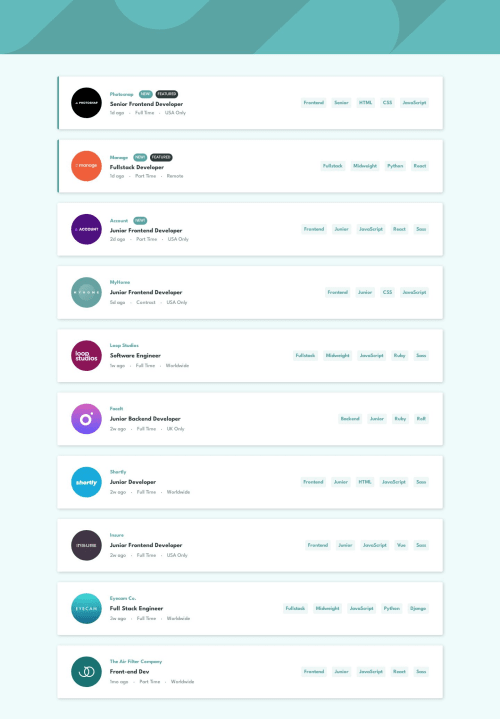
Job listings page using React/Flexbox
react
@michael-truscott

Solution retrospective
Getting the image to sit above the container in the mobile design was challenging, ended up using position: absolute with a negative top.
Code
Loading...
Please log in to post a comment
Log in with GitHubCommunity feedback
No feedback yet. Be the first to give feedback on Michael Truscott's solution.
Join our Discord community
Join thousands of Frontend Mentor community members taking the challenges, sharing resources, helping each other, and chatting about all things front-end!
Join our Discord