Design comparison
SolutionDesign
Solution retrospective
any feedback is welcome!
Community feedback
- @al3xbackPosted almost 3 years ago
Hi Natasya,
My feedback is:
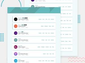
- It would be better if we set image on header to be a background-image instead of img tag. The reason is:
a) this is just static image and never changing too often (even no need for CMS setup for future). b) we are not going to use picture element for better rendering. c) less code.. haha- on
main, changes will be:
main {
    ...
    flex-wrap: wrap; //remove
    align-items: center; //remove
}
we dont need
align-items: centercos each.listelement has width property 100%, then this has no effect :) and we dont needflex-wrap: wrapcos we dont set exact height to it.Marked as helpful0@notanutPosted almost 3 years ago@al3xback thank you for the feedback! I already had tried to make it a background image instead of img element. unfortunately, it couldn't work. maybe I used the wrong path because it said "can't be found". for the flex-wrap and align-items, I will fix them!
0
Please log in to post a comment
Log in with GitHubJoin our Discord community
Join thousands of Frontend Mentor community members taking the challenges, sharing resources, helping each other, and chatting about all things front-end!
Join our Discord
