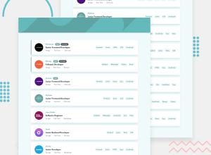
Design comparison
SolutionDesign
Solution retrospective
If you find anything which can be improved or is wrong practice, feel free to give your feedback.
All Feedback welcome
Community feedback
- @jkellermanPosted about 2 years ago
Hey Reyan, very nice solution.
Just one suggestion:
In mobile view, your li elements are too thin which is squashing the some of the contents together and the span element that says "featured" is overflowing for the first li element. A quick fix would be to set a min-width of the li element to 90% and you'll see that the content isn't squished anymore.
Hope this helps. Apart from that looks great!
Marked as helpful0
Please log in to post a comment
Log in with GitHubJoin our Discord community
Join thousands of Frontend Mentor community members taking the challenges, sharing resources, helping each other, and chatting about all things front-end!
Join our Discord
