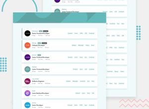
Design comparison
Solution retrospective
I need help, the website did not come out like the one that was give to us. If any one is welling to go through my code as advice me, I would truly appreciate it.
Community feedback
- @SvitlanaSuslenkovaPosted 2 months ago
Maybe, you will consider to do some easier challenges first and then return to this one. Because, it feels like it was difficult and you left it unfinished. I'm not discouraging you, you did a lot, but there are some issues that you could solve yourself, but with more experiene. Please, don't be sad about my comment, keep going.
Marked as helpful0 - @huyphan2210Posted 2 months ago
Hi, Zizo95
I've reviewed your solution and noticed several issues. Here are a few key points:
- Your page doesn’t use the recommended font-family specified in the style-guide.md. Please either include it in your CSS file or link it in your HTML.
- In your CSS file, you have classes named section1 through section9 with identical styles. Instead of creating multiple classes, consider using a single class named "section" for these elements. Additionally, since these are sections, it would be better to use the <section> tag instead of <div>. Also, the "job-listing" class seems to be unused in your styling—what is its purpose?
- Try to use more descriptive names for your classes. Look into CSS naming conventions and choose one that suits your needs.
There are other issues as well, which suggest that you might have rushed through the learning process. I recommend revisiting the beginner challenges and refining your skills. Master the basics before moving on to more advanced topics.
I hope my responses are helpful to you.
Marked as helpful0
Please log in to post a comment
Log in with GitHubJoin our Discord community
Join thousands of Frontend Mentor community members taking the challenges, sharing resources, helping each other, and chatting about all things front-end!
Join our Discord
