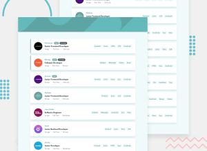
Design comparison
Community feedback
- @adarshcodesPosted almost 4 years ago
Hi @Ajdevise, I believe you are doing great. You did a great job on this challenge👏. Let's talk about briefly:
- Design aspect: Desing is very similar to the provided design and the filtering functionality is working nice. You can take care of the header image as @abhik-b mentioned above.
- Responsiveness: it's working smoothly and fine.
- Issues aroused: Give the HTML issues a shot to solve. Keep it up👍. Happy Coding😀
3@AjdevisePosted almost 4 years ago@adarshcodes Thank you for the feedback 🥳. I will try to fix those things as soon as possible.
2 - @abhik-bPosted almost 4 years ago
Hi Ajdevise 👋 Your solution is fantastic , the filters work perfectly and cards are very responsive 💯
** Just a opinion : ** for the desktop screens you might want to change the header image to desktop image!
Happy coding 😇 & Keep contributing these Fantastic solutions 🚀
2@AjdevisePosted almost 4 years ago@abhik-b Thank you for the feedback 🥳. I totally forgot about that desktop image 😅.
2 - @mesutcifciPosted over 3 years ago
Hey Adjevise Congrats.
We have three elements tagged as Fullstack, but when I click on the Fullstack tag I see only two jobs are listed.
1
Please log in to post a comment
Log in with GitHubJoin our Discord community
Join thousands of Frontend Mentor community members taking the challenges, sharing resources, helping each other, and chatting about all things front-end!
Join our Discord
