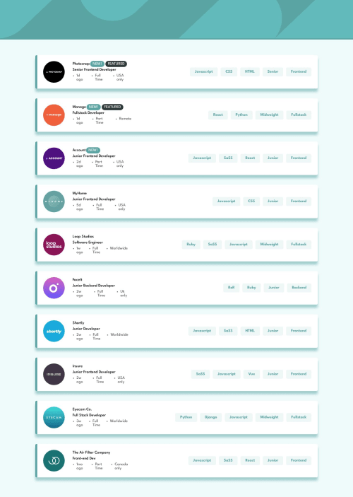
Job Board with functional filters and responsive design.

Solution retrospective
Worked on this project in tandem while partaking in a Front end bootcamp.
The filtering was a little bit challenging but it wasn't that hard to implement once I read up on .map() and .filter() the site is responsive all the way down to smartphone sized devices.
I took some design liberties here and there but I followed the PSD pretty closely all things considered.
Proud of my filtering functions and how I broke the site's JS down into bite sized functions that can be re-used anywhere if needed, re-rendering the entire page using inner text is probably not the most efficient way and could be easily fixed by using react but i am not quite there yet.
Please log in to post a comment
Log in with GitHubCommunity feedback
No feedback yet. Be the first to give feedback on Michele's solution.
Join our Discord community
Join thousands of Frontend Mentor community members taking the challenges, sharing resources, helping each other, and chatting about all things front-end!
Join our Discord