Design comparison
SolutionDesign
Solution retrospective
- The difficulty was picking out and displaying the values from the span.
Community feedback
- @mmmsss211Posted about 1 year ago
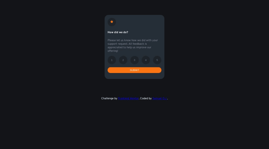
You need to fix the dimensions since the buttons are all squished.
Marked as helpful0 - @BlackpachamamePosted about 1 year ago
Greetings CodzSchach! You have done a good job, it was not such a simple challenge, but you have made it work. I can leave you some tips:
- If you want the
buttonto look like a circle, then you should apply the same width and height size. In this case you should definewidth: 45pxandheight: 45px - If you want to remove the border from the
button, you can simply apply theborder: noneproperty to them - Your main content should be inside a
mainand thedivwith classbtm-textshould be afooter. This to improve the semantics of the site - I do not recommend using
%to define thewidthor theheight, the ideal is to use the unitremorem - You can center content in the center of the screen by applying
flexboxproperties to yourbody - Here is my solution in case you want to take a look
Marked as helpful0 - If you want the
Please log in to post a comment
Log in with GitHubJoin our Discord community
Join thousands of Frontend Mentor community members taking the challenges, sharing resources, helping each other, and chatting about all things front-end!
Join our Discord
