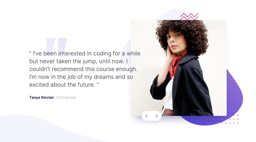
Design comparison
SolutionDesign
Solution retrospective
Any feedback is welcome, I'll appreciate!
Community feedback
- @shashiloPosted over 4 years ago
Good job Alan. Visually, this is close to the design. I like the hover state for the arrows. It's very subtle but effective.
You are missing some details within the design and I'd restructure your
displaystyles.- Image is not in the correct position based off the background image.
- Image is missing
border-radiusand thebox-shadowis too heavy. - Font weight and color do not match the design.
- If you wrap a
.containeraround you section with a.max-width, it will be easier to control the position of your columns. Also, I'd avoid usingposition: absolutein this instance. This can be accomplished using just Flexbox. - On mobile, the second slide's title is missing.
1 - @alanhcrdzPosted over 4 years ago
Thank you! it's great to have your feedback, looks like I've yet missed some details.
0
Please log in to post a comment
Log in with GitHubJoin our Discord community
Join thousands of Frontend Mentor community members taking the challenges, sharing resources, helping each other, and chatting about all things front-end!
Join our Discord
