Design comparison
SolutionDesign
Solution retrospective
I will accept every opinion and advice :)
Community feedback
- @GerbenDolPosted over 4 years ago
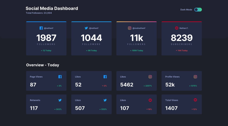
Hey! Your solution is looking really good, I love the transition when I switch to dark mode. ✨
There's a few things I'd look into:
- The circle in your toggle is not vertically centered
- The gradient in the toggle is a bit off
- I'd love to see a hover effect on the cards
- You switch to a full width card very soon. Maybe try adding a step in between with two cards per row?
Hope this helped! 😁
1
Please log in to post a comment
Log in with GitHubJoin our Discord community
Join thousands of Frontend Mentor community members taking the challenges, sharing resources, helping each other, and chatting about all things front-end!
Join our Discord
