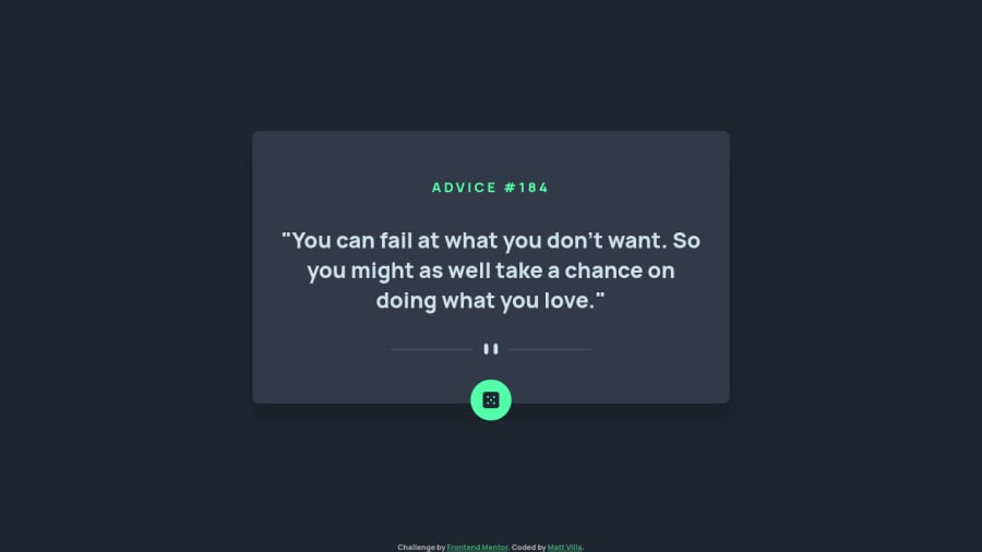
Design comparison
Solution retrospective
Any feedback at all is appreciated, thank you.
Community feedback
- @Bayoumi-devPosted almost 3 years ago
Hey!
Here are some suggestions:
Buttons must have the discernible text, Set the attributearia-labelto describe the button.
<button id="dice-button" aria-label="Advice Generator">
  <svg>//...</svg>
</button>
Document should have one main landmark, Contain the component with<main>.
<main> <div class="advice-container"> //... </div> </main>-
Page should contain a level-one heading, Change<div class="advice-number" id="advice-num">to<h1 class="advice-number" id="advice-num">You should always have oneh1per page of the document... in this challenge, you will useh1just to avoid theaccessibility issuethat appears in the challenge report... but don't useh1on small components<h1>should represent the main heading for the whole page, and for the best practice use only one<h1>per page. -
All page content should be contained by landmarks, Contain the attribution with<footer>.
<footer>
   <div class="attribution">
      //...
   </div>
</footer>
I hope this is helpful to you... Keep it up👍
Marked as helpful0
Please log in to post a comment
Log in with GitHubJoin our Discord community
Join thousands of Frontend Mentor community members taking the challenges, sharing resources, helping each other, and chatting about all things front-end!
Join our Discord
