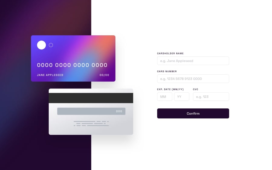
Design comparison
Solution retrospective
One area I find difficult when styling was making the two cards overlap in a mobile environment. According to the design, the Front-card is supposed to cover some part of the Back-card but when I reduced the margin and changed the position of the Front-card using CSS transform properties, the reverse happened and the front-card was kind of staying behind the back-card. What I did to solve this was to add both card twice in my HTML; one for desktop and mobile device while setting the display to none for each device to avoid repetition. So, for the mobile HTML, I added the back-card image first before adding the front-card image(the reverse of what I did for desktop ) and somehow that solved the problem. I'm not really sure that it's a good practice, so I would really like to know if there's a better way to go about that without having to write the markup twice... Thanks in anticipation
Community feedback
- @TheAce74Posted about 2 years ago
Congrats on completing the challenge. About the question you asked, next time try tackling the positioning with the "position" property and not the "transform". I'll admit that "transform: translate()" has a bunch of important use cases but "playing around" with positions: absolute and relative would have given you a better result; just by dropping a z-index, you can even throw transform in the mix too
Marked as helpful1 - @JAleXDesigNPosted about 2 years ago
Hi Salamah, congrats on completing the challenge, to place an element on top of another you can use the z-index property, for this the element to which you apply the z-index must have the "position" property, whether it is relative, absolute... . I hope my comment will be useful to you.
1
Please log in to post a comment
Log in with GitHubJoin our Discord community
Join thousands of Frontend Mentor community members taking the challenges, sharing resources, helping each other, and chatting about all things front-end!
Join our Discord
