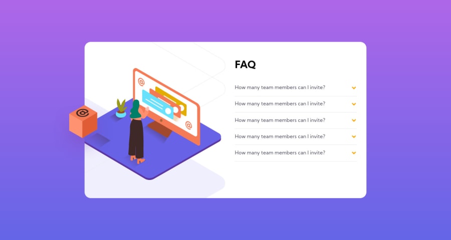
Design comparison
Solution retrospective
What do you think! I think I used some hacky methods, I definitely didn't think this was newbie level though, when it comes to image positioning and the overflowing of elements, along with z-index shenanigans. Great refresher for me! Let me know if I did alright
Community feedback
- @ApplePieGiraffePosted over 3 years ago
Greetings, Anthony Rodriguez! 👋
Nice job on this challenge! 👏 Your solution looks good and the accordion card works rather well! 👍 You are right that the positioning of some of the elements in this challenge can be a bit tricky to get right! 😅
The only thing I have to suggest is to perhaps move the illustration a little closer to the left of the card in the desktop layout so that the shadow in the illustration and the floating cube are a little more aligned. 😉
By the way, you can use the native HTML
<details>
and<summary>
elements to easily create a fairly accessible accordion without having to use any JS. If you’d like to learn more about those elements and how you can use them, check out this helpful article from MDN.Keep coding (and happy coding, too)! 😁
1@LuwuuPosted over 3 years ago@ApplePieGiraffe Thanks! I didnt know that, thats super useful
0 - @palgrammingPosted over 3 years ago
Well you can kind of divide this challenge in two parts build out the FAQ questions and get that part functional and sized right and then do the layout knowing already what size your FAQ section ends up. You should start using the correct text for your questions and answers.
0
Please log in to post a comment
Log in with GitHubJoin our Discord community
Join thousands of Frontend Mentor community members taking the challenges, sharing resources, helping each other, and chatting about all things front-end!
Join our Discord