Design comparison
Solution retrospective
Reviews and assessment will be highly appreciated
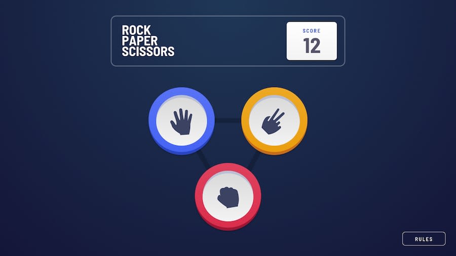
I need recommendations on how to improve the UI, particularly to make the background as the one in the design after the user has played. Also i will appreciate help on designing the options
Thank you for your time
Community feedback
- @docuong0912Posted over 2 years ago
About your question, i would recommend creating a new empty div and creating its pseudo class element and then set back ground color to white, set opacity for each background element. I don't know if its a good solution but i currently apply that to my solution and it worked well
There are 2 options to style the (rock,paper,scissor) choices background, first create round div element and then set big border size with specific color or create 2 round div lies on each other.
Hope that help!
1
Please log in to post a comment
Log in with GitHubJoin our Discord community
Join thousands of Frontend Mentor community members taking the challenges, sharing resources, helping each other, and chatting about all things front-end!
Join our Discord
