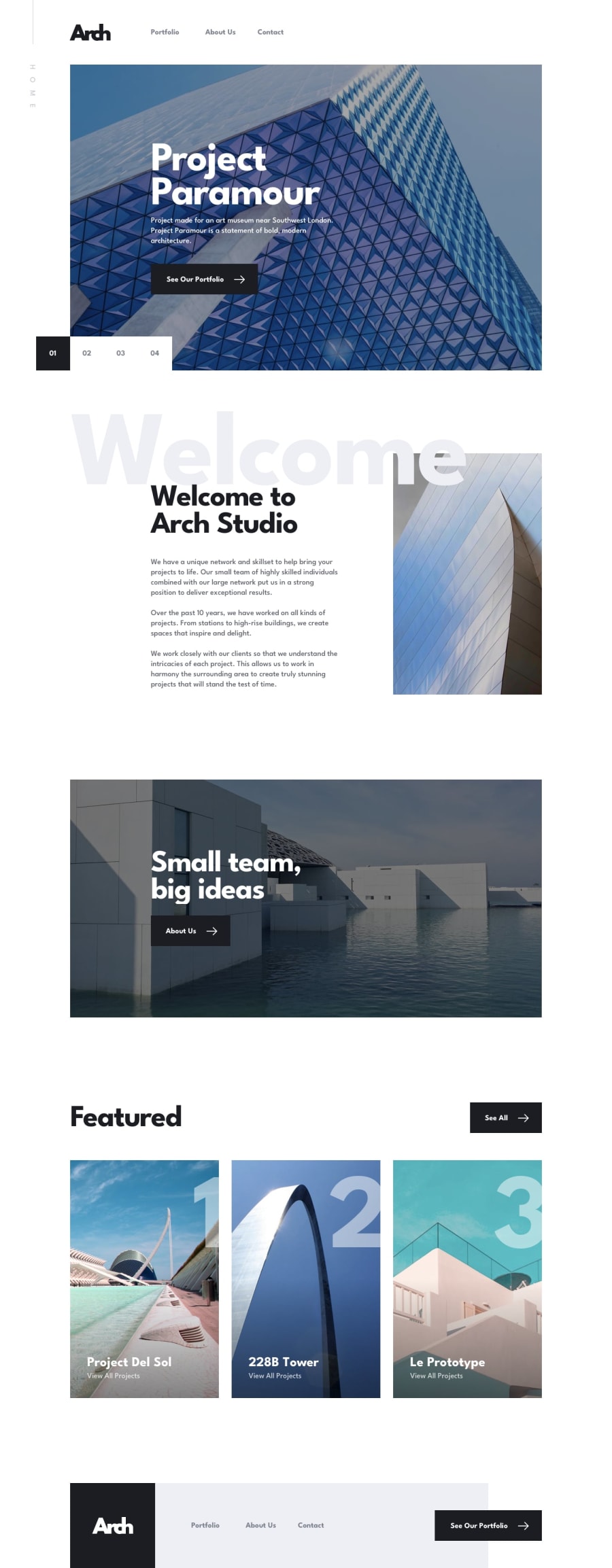
Design comparison
Solution retrospective
I'm so happy i've completed styling this challenge. Used Gatsby and styled components. I'm learning how to code a lil bit more than 2 months(it was the time i started learning what is <div> in html) so this one was rly big. What do i learned from it? To much to be able to write here :D . Mainly how to gatsby, and how to css, and that i know nothing :D So much to learn, so much to improve.
It is still not done yet!!!
Need to change the images sizing, THEY R WAY TO BIG!
Need to add form validation, and makes it work (fullstack incoming) probably i'll do it tomorrow but wanted to share this one with u atm.
Wanna add some graphQL, it's the next step i'm gonna make.
#StillNotJuniorFrontendDev
If some1 could give me a feedback, it would be great! About the code aswell! I dont know any frontend developers which could give me some advices :(
I'm selflearning tho, this is the result of my hard work
Community feedback
Please log in to post a comment
Log in with GitHubJoin our Discord community
Join thousands of Frontend Mentor community members taking the challenges, sharing resources, helping each other, and chatting about all things front-end!
Join our Discord
