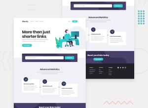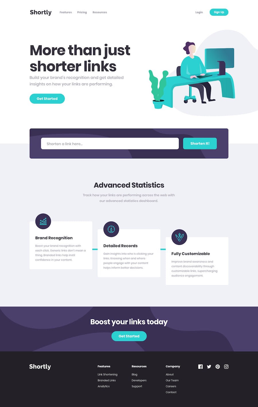
I've employed a combination of grid layout and flexbox in my project
Design comparison
Solution retrospective
Clean Code Reflection:
-
I'm not entirely sure if this is the optimal approach for ensuring page responsiveness, but I dedicated a substantial amount of effort to crafting numerous media queries to achieve the desired level of responsiveness. Admittedly, my JavaScript files were a bit messy. Despite my eagerness to delve into a JavaScript framework, I opted to test my skills by taking on this project independently.
-
The endeavor proved time-consuming due to my limited experience, prompting me to refine various aspects after the initial build. This challenge was compounded by my decision to embark on the project immediately after completing my JavaScript course. Despite the hurdles, including extended vacation breaks, I persevered and ultimately gained valuable insights. 😅
Community feedback
- @Official-NakulPosted about 1 year ago
you forgot to add cursor pointer in shorten in button,and can you tell me how can i change error message
Marked as helpful1@ahhmedsafwatPosted about 1 year agoWhen you use a none link the api will send a code message = 1 so you use this massage to make an if condition than in this block of code you create a span and style it using css look at the code in ./js/fetchapi in the if else condition @Official-Nakul
1
Please log in to post a comment
Log in with GitHubJoin our Discord community
Join thousands of Frontend Mentor community members taking the challenges, sharing resources, helping each other, and chatting about all things front-end!
Join our Discord
