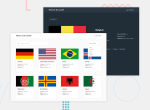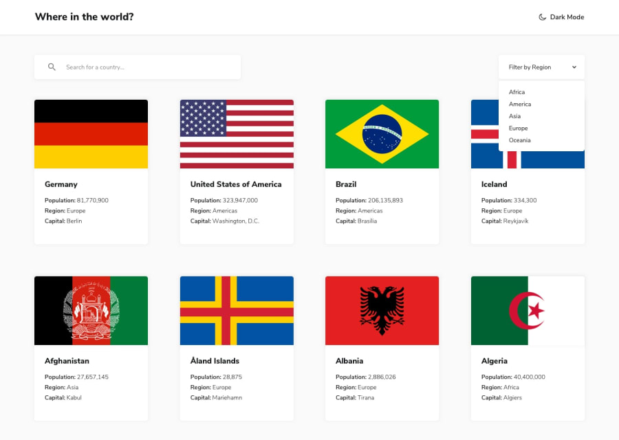
I've completed this coding challenge from @frontendmentor!.
Design comparison
Solution retrospective
Any suggestions on how I can improve are welcome!
Thanks.! 😄
Community feedback
- @amita125Posted about 1 year ago
Hi cesar, the project looks really good.
- Click on a country to see more detailed information on a separate page
- Click through to the border countries on the detail page
Adding the additinal requirements to the project, you could improve the project further.
- Maybe try adding some test for the components could be good idea and practice as well. [optional]
In terms of visual improvements which i think could be improved could be the way the cards are displayed meaning changing the grid cols to more than 3 for large screen size could improve. As viewing in the large screen, the card looks very big and the spaces could be used to display more cards.
Maybe use of pagination could be good idea, instead of user scrolling. [small suggestion]
Overall, the project is good.
Congratulation for completing the challenge.
Marked as helpful0@cesar-velazquezPosted about 1 year agoHi @amita125 i thank you for the time that you took for advices, i will improve the project. 😀 You have a great eye for this.
0
Please log in to post a comment
Log in with GitHubJoin our Discord community
Join thousands of Frontend Mentor community members taking the challenges, sharing resources, helping each other, and chatting about all things front-end!
Join our Discord
