Submitted over 2 years ago
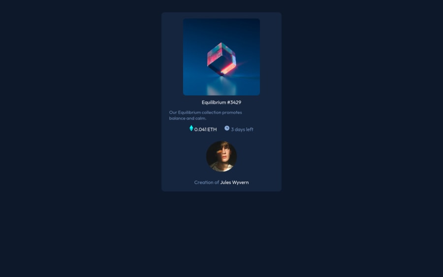
its simple html and css, i try my best and i need some help
@Juniplay
Design comparison
SolutionDesign
Solution retrospective
First of all, i need some help in semantic and in css, its my firts challenge project here, so where i need change?
Community feedback
- @RajSanjelPosted over 2 years ago
Congrats on finishing your 1st projects.
- If you are confused about where to use semantic tags you can learn by clicking here
- You should learn about grid and flex boxes to make layouts. Some resources for it are
If you need any help you can contact me.
Marked as helpful2 - @vanzasetiaPosted over 2 years ago
Hey, E.Júnio! 👋
For the HTML, I recommend,
- Fixing all the issues that have been generated.
- Wrapping all the elements that have a
:hover
effect with an interactive element like an anchor tag. - The clock icon and the Ethereum icon are decorative images. So, I recommend leaving the
alt=""
empty to hide those icons from screenreader users. By doing this, the screenreader users can focus on the actual page content. - Removing the underscore from the alternative text. Alternative text is the same as the other text (not like code).
For the CSS, I suggest,
- Using single class selectors for styling whenever possible instead of
id
.id
has high specificity which can lead to a lot of issues on the larger project. It's best to keep the CSS specificity as low and flat as possible. 😉 - Using
rem
or sometimesem
unit instead ofpx
. Usingpx
will not allow the users to control the size of the page based on their needs. I recommend reading this tutorial article aboutrem
andem
unit. This article explains both units in a simple way. I recommend reading it if you're not confident to use those units. - I recommend selecting the
body
element directly rather than using the.bg
class. Also, I recommend usingmin-height
if you need to set a height on thebody
element. This way, it will allow growing if ever needed. - I recommend using flexbox to,
- Position the card in the middle of the page by making the
body
element as the flex container - Align the card elements (avatar with the text next to it and
.icon
section)
- Position the card in the middle of the page by making the
- I didn't use grid to finish this challenge. So, it's up to you if you want to learn about it now or later.
I hope this helps! Good luck on finishing the challenge! 👍
Marked as helpful0
Please log in to post a comment
Log in with GitHubJoin our Discord community
Join thousands of Frontend Mentor community members taking the challenges, sharing resources, helping each other, and chatting about all things front-end!
Join our Discord