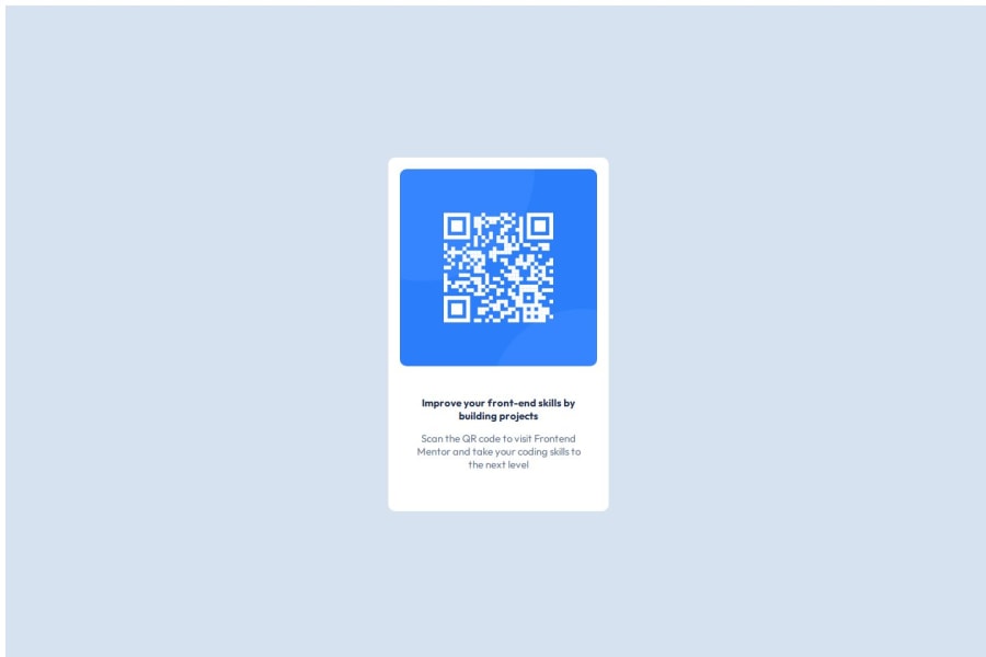
Design comparison
Solution retrospective
Static values were challenging for me but still it made me proud to do it. Next time I would like to make more flexible and responsive designs.
What challenges did you encounter, and how did you overcome them?I had a hard time with the values being static. I overcame this by entering static values one by one.
What specific areas of your project would you like help with?I would like to have a flexible design that is completely design-oriented and not dependent on dimensions.
Community feedback
- @timilica29Posted 5 months ago
-
The implementation on the description part has not the right alignment and size. Instead of 2 p elements you should have a h1 and a p
-
You could also add a description into the alt attribute of the qr image for more accessibility
-
For more clean code you could implement css in a separate file so you don't have all of the code in one place
-
Also you could align the code to be easier to read
0 -
Please log in to post a comment
Log in with GitHubJoin our Discord community
Join thousands of Frontend Mentor community members taking the challenges, sharing resources, helping each other, and chatting about all things front-end!
Join our Discord
