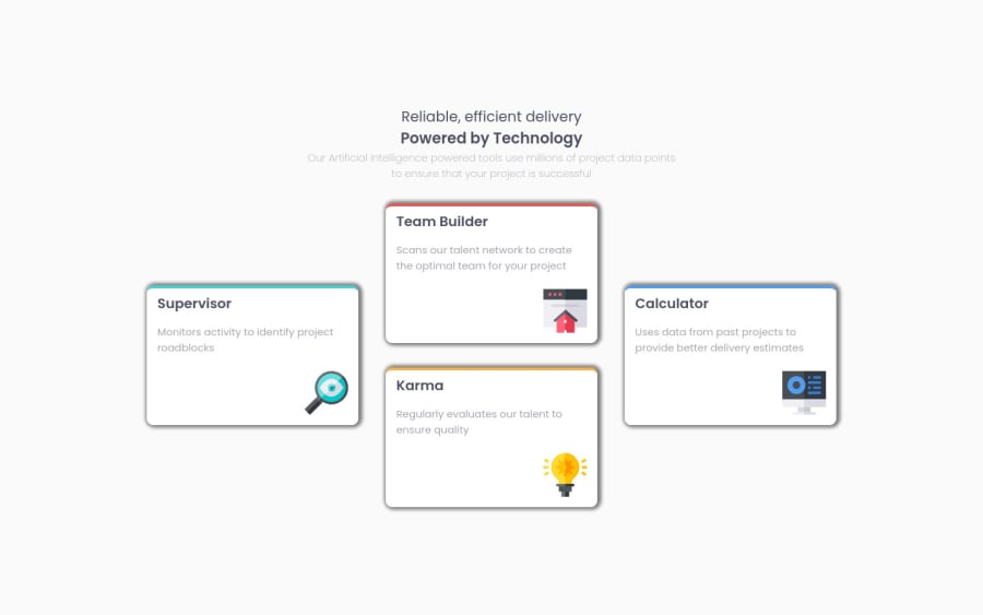
It was fun completing this challenge use HTML, CSS and flexbox
Design comparison
Solution retrospective
Feedback on my code will be appreciated and need suggestions for box-shadow. Thank you 😊
Community feedback
- @PhoenixDev22Posted about 3 years ago
hello @arunsingh009 ,
I have some suggestions regarding your solution :
-
try to make the shadows softer like the design .
-
For any decorative images, each
imgtag should have emptyalt=""andaria-hidden="true"attributes to make all web assistive technologies such as screen reader ignore those images. -
I recommend to remove heights widths from the cards. Let the content inside the card element dictate the height of it. Also using widths in percentage. Not a great idea as you're losing control of the layout. Use max-width instead, let it grow to a point.
-
never use
pxfor font size.
Hopefully this feedback helps.
Marked as helpful2 -
Please log in to post a comment
Log in with GitHubJoin our Discord community
Join thousands of Frontend Mentor community members taking the challenges, sharing resources, helping each other, and chatting about all things front-end!
Join our Discord
