


JonathanDev• 15
@JADeveloper
Posted
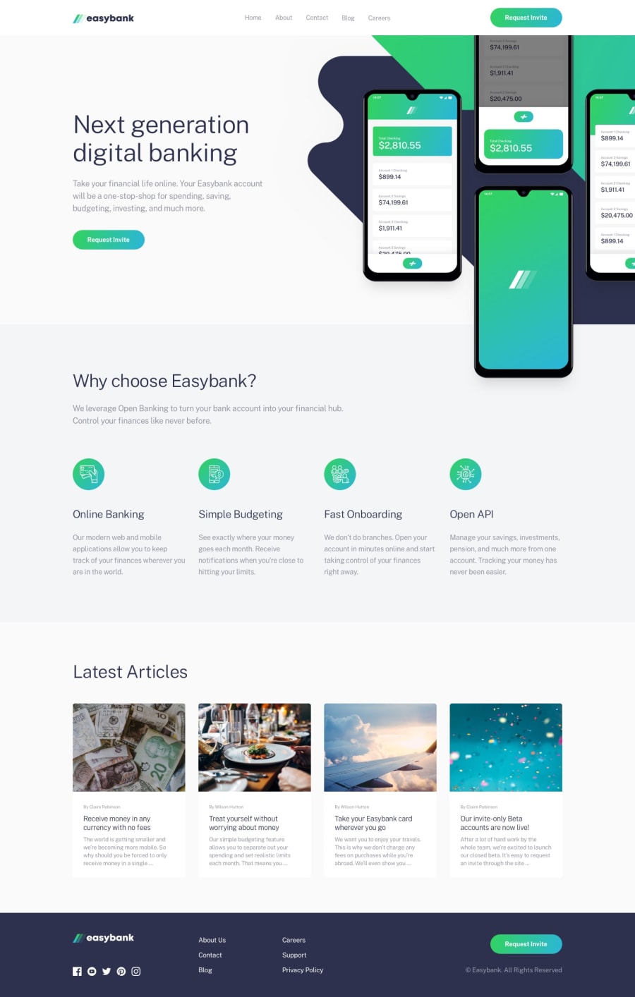
Te puedo sugerir que tu diseño sea el protagonista no que el dispositivo sea el protagonista, "móvil" después todo se ve muy bien saludos.
Marked as helpful
0
This was Superb Designed! It was little hard for making it responsive, but did it! It took me 2 days to complete this project, but this was my #6 project so it was not much hard to develope it. Hope you love the content....
@JADeveloper
Posted
Te puedo sugerir que tu diseño sea el protagonista no que el dispositivo sea el protagonista, "móvil" después todo se ve muy bien saludos.
Marked as helpful
Greetings Atul
alt values must be descriptive for the benefit of assistive tech users to be able to visualize the message that is being put across. If the image is decorative use alt="". The following alt value is not beneficial to assistive tech users <img src="/images/bg-intro-desktop.svg" alt="Background_intro" id="background_home"><img src="/images/icon-hamburger.svg" alt="humburger" id="humburger">
<img src="/images/icon-close.svg" alt="closemenu" id="close_menu">
Semantic html matters and should be used where ever possible. Here is an example that you can have a look at.
<button aria-label="open navigation menu">
    <img src="/images/icon-hamburger.svg" alt="" id="humburger">
  </button>
.ul_footer_1 ul li a:hover{
    color: var(--LimeGreen);
}
Happy coding
Marked as helpful
Join thousands of Frontend Mentor community members taking the challenges, sharing resources, helping each other, and chatting about all things front-end!
Join our Discord
