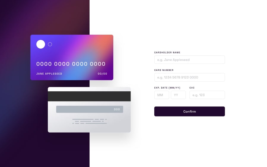
Design comparison
SolutionDesign
Solution retrospective
This isn't complete just want some helpful feedbacks
Community feedback
- @GeorgeDarisPosted over 1 year ago
Hey, there!
You have made quite some progress from what I can see. The data from the form gets displayed on the cards as intended, and you have placed a check to make sure the user fills out the form before being able to submit it.
Here are some things you could consider to improve your app:
- Use relative units, such as rems, to make your design more responsive.
- Your cards are inside divs which take up more space than the cards themselves, making the form inaccessible when the width of the screen becomes smaller.
- Instead of using absolute positioning for the cards, consider placing them inside a grid container and using gaps or margins to create the spacing you are looking for. This can help make it work for mobile devices as well, where you would have a one column grid with two rows: one for the cards, and another for the form.
- The large top margin you have set on the form could be replaced by justifying the items of your container in the center. No matter how large or small the screen, your content will be placed in the middle vertically.
I hope this helps you consider some solutions to your problems. I would highly suggest you read articles from MDN Web Docs, as they cover a wide range of topics related to CSS and web development in general.
Happy coding!
Marked as helpful1
Please log in to post a comment
Log in with GitHubJoin our Discord community
Join thousands of Frontend Mentor community members taking the challenges, sharing resources, helping each other, and chatting about all things front-end!
Join our Discord
