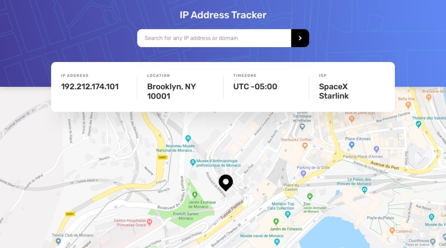
Design comparison
SolutionDesign
Community feedback
- @oroszlanoloPosted over 1 year ago
Hi, congratulations on completing your challenge. I have some suggestions for you: Even though you have implemented both the desktop and mobile version of the design, I would not say your page is responsive, since it works for these two specific widths only. To create a responsive layout, I have some basic tips:
- Do not specify a fixed width to your outer container. Your outer most container should have a width of 100%
- Even if you don't use 100%, you still can use percentage instead of fixed pixle sizes.
- You can use dvh and dvw units for your sizes. https://dev.to/frehner/css-vh-dvh-lvh-svh-and-vw-units-27k4
- In some cases you can specify a max-width to your container, so it won't grow too wide on large screens
- on small screen sizes, Instead of giving an explicit width to your container (like you did with the input for example) give it a width of 100% and a padding to your outer container
- use box-sizing: border-box on everithing, it will make your life easier
- you could've used transform translate on the -50% Y axes as well for the address details container So basicly try to use fix sizes only for paddings, margins and font sizes.
I hope I was useful, good luck for your following challenges :)
Marked as helpful0@GustavoSDSPosted over 1 year agoHi @oroszlanolo. Thank you for your comments, I will try to improve those details.
0
Please log in to post a comment
Log in with GitHubJoin our Discord community
Join thousands of Frontend Mentor community members taking the challenges, sharing resources, helping each other, and chatting about all things front-end!
Join our Discord
