


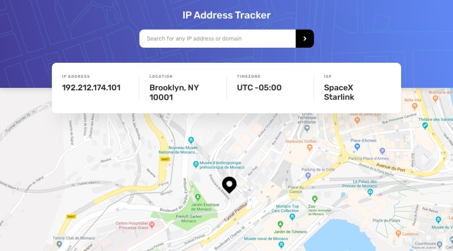
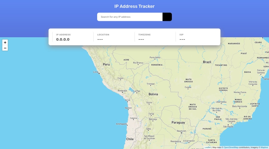
Design comparison
Solution retrospective
Added some functionality for mobile devices to hide/show the IP information field, since it blocks most of the map.
questions:
-
on the IP information card, I tried using flexbox wrap to achieve the row (desktop) to column (mobile) response ------ but I couldnt figure out a way to avoid the ugly/disproportionate 'three cards on top (ip, location, timezone)- one card below (isp)' in the screen sizes transition (around tablet size)... Is there a way to make items wrap 'by two' to avoid that?
-
any tips for real big screens? I'm giving the body a max-width and positioning in the middle with margin: 0 auto; but trying to figure out how the site looks on a big big screen is much harder than checking for mobile screens... I can't say if the text and elements are looking incredibly small for real or its just the fact that I can only view a zoomed-out version of a bigger screen in my 1440...
any thoughts?
thanks,
Community feedback
Please log in to post a comment
Log in with GitHub
Join our Discord community
Join thousands of Frontend Mentor community members taking the challenges, sharing resources, helping each other, and chatting about all things front-end!
Join our Discord