Submitted over 2 years agoA solution to the IP Address Tracker challenge
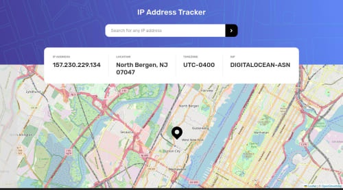
IP Address Tracker with IPAPI and Leaflet
accessibility
@joshdail

Solution retrospective
Here is my solution to the challenge. I did make a few adjustments from the original design:
- Search bar has an added outline for focus state to improve visibility
- Site displays in dark mode if the browser prefers a dark color scheme (the search bar and results bar are darkened, and the map is overlaid with a filter to reduce brightness)
- I used IPAPI instead of IP Geolocation API for looking up IP addresses, since it does not require an API key and has a more generous free tier. This does come at the cost of the app not being able to take domain names as input. Only IPV4 and IPV6 addresses can be accepted
Feedback, comments, suggestions are always welcome.
- The results bar is designed to have a responsive rather than a fixed width. This is mainly to accommodate longer IPV6 addresses or location names
Code
Loading...
Please log in to post a comment
Log in with GitHubCommunity feedback
No feedback yet. Be the first to give feedback on Joshua Dail's solution.
Join our Discord community
Join thousands of Frontend Mentor community members taking the challenges, sharing resources, helping each other, and chatting about all things front-end!
Join our Discord