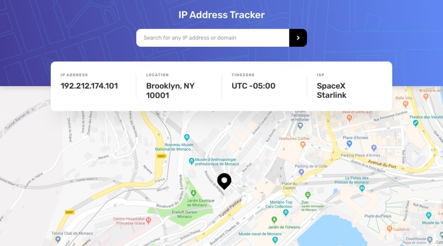
Design comparison
SolutionDesign
Solution retrospective
I need help making it more responsive.
Community feedback
- @ChamuMutezvaPosted over 3 years ago
Well done , the desktop site is looking awesome. Some other things to look at are:
- Let the first heading of your site be an h1(a site should have one h1 element) and the headings must ascend in order - h1, h2, h3 etc.
- use semantic elements where possible , eg header, main , footer etc.
Good lucky
Marked as helpful0
Please log in to post a comment
Log in with GitHubJoin our Discord community
Join thousands of Frontend Mentor community members taking the challenges, sharing resources, helping each other, and chatting about all things front-end!
Join our Discord
