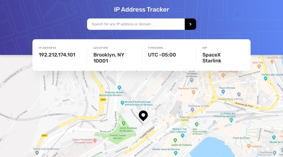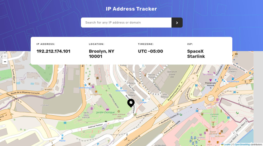
Design comparison
Solution retrospective
Hello world!, If you have any suggestions feel free to comment :D
Community feedback
- @karthik2265Posted about 2 years ago
Hey 🙋♂️, Cosmo
looks awesome well done. The responsiveness is also very good.
Some things I would prefer to change,
The jsx would be much cleaner if we split up the TableInfo component like for example
<> <li><span>IP Address:</span><span>{info.ip || "---"}</span></li> <li><span>Location:</span><span>{info.location.region || "---"}</span></li> <li><span>Timezone:</span><span>UTC {info.location.timezone || "---"}</span></li> <li><span>ISP:</span><span>{info.isp || "---"}</span></li> this part can be made a separate component and we can call it Info component, and
<ErrorMessage> <svg fill="#ff4848" height="24" width="24" xmlns="http://www.w3.org/2000/svg"><path d="M23 7.444v9.112L16.556 23H7.444L1 16.556V7.444L7.444 1h9.112L23 7.444ZM15.728 3H8.272L3 8.272v7.456L8.272 21h7.456L21 15.728V8.272L15.728 3ZM12 17.998a1 1 0 1 1 0-2 1 1 0 0 1 0 2Zm-.997-12h2v8h-2v-8Z" /></svg> {error || "Oops something is wrong"} </ErrorMessage>this part can be made a separate component and we can call it ErrorInfo component.
Doing this in my opinion will make the jsx more readable and less clutterred.
Overall the app is great.
How did you build the loader.svg ? looks cool
Thank You
Marked as helpful1@cosmoartPosted about 2 years ago@karthik2265 Hi Karthik!, Thanks for the feedback, I really appreciate that you have taken the time to see the code.
You're right, the code was a bit messy. I've created a new component and cleaned up a few things.
The loader.svg I have taken from a codepen
Thank you!
1
Please log in to post a comment
Log in with GitHubJoin our Discord community
Join thousands of Frontend Mentor community members taking the challenges, sharing resources, helping each other, and chatting about all things front-end!
Join our Discord