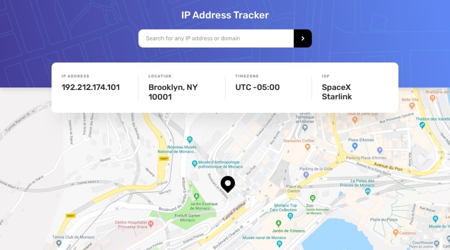
Design comparison
Solution retrospective
Hello everyone, kindly check and give your feedback(s). Thank you
Community feedback
- @grace-snowPosted about 4 years ago
Hi,
Looks really nice on my phone, but I can see a few (easily fixable) accessibility issues when I look at the html. Like:
- your label for the search button. GREAT that you included it, so many people forget. But it's empty
- your clickable icon should be inside a button
- your input and icon should be inside a form
- all your results are in divs - try to use semantic html tags for that and maybe give it a visually hidden heading.
All this stuff is really easy to fix but really important when it comes to real production work.
Only other thing I'd suggest is try using icons as svg in your code instead of importing the whole font awesome library. It's huge and you'll rarely import libraries like that in the real world of work.
Hope all that's helpful. Have fun!
2 - @grace-snowPosted about 4 years ago
And from the css only one thing to change: pretty much never use ids for styling. They have high specificity and its considered bad practice. Use a class instead, and only nest those classes when it's completely unavoidable.
0 - @ApplePieGiraffePosted about 4 years ago
Good job on this challenge, temitope! 👍
Your solution looks good, is responsive, and works great! 🙌
Keep coding (and happy coding, too)! 😁
0
Please log in to post a comment
Log in with GitHubJoin our Discord community
Join thousands of Frontend Mentor community members taking the challenges, sharing resources, helping each other, and chatting about all things front-end!
Join our Discord
