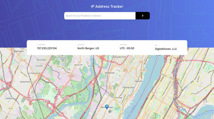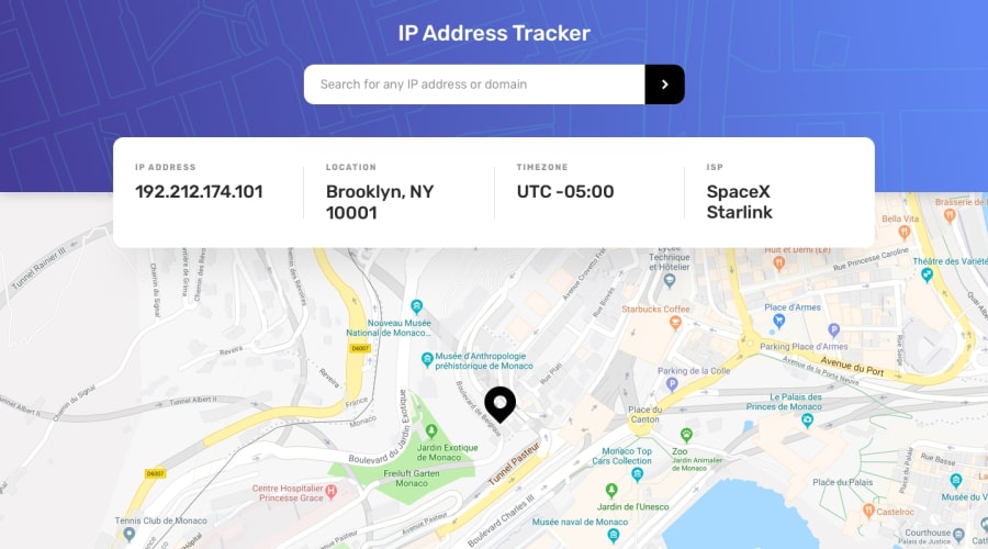
Design comparison
Solution retrospective
Had a lot of fun working with the API to get the data back, and using tailwind to style. Still learning lots about tailwind, if anyone has any tips – send them my way!
Still trying to work on adding the divider into the location information box.
Community feedback
- @SaishSankhePosted over 1 year ago
Hello! The app works great! 👌🏽
About adding the divider, I did it by adding a left border to the inner items (except 1st child), plue some left padding. Or you can do it the other way round, by adding right border plus right padding (except last child).
Hope this helps! 🙌🏽
Marked as helpful0 - @visualdennissPosted over 1 year ago
Your solutions looks great, both on mobile and desktop! Congrats on completing the challenge successfully. Its JS Logic and API requests seem to work flawlessly as well. One suggestion to improve user experience would be perhaps having the cursor: pointer; only for buttons and not for the areas that don't respond to click events, such as the background image of the header etc.
Hope you find this feedback helpful!
Marked as helpful0 - @0xabdulPosted over 1 year ago
Hey there ! 👋 Congratulations you finished the IP Address tracker ...🎉
- Some suggestions for you improve your code🤔
Html 🏷️:
- for Accessibility reports using the non-semantic elements (or) semantic elements..
- semantic elements :
<aside> , <artical> , <main>, <header> ,<section><footer>, <form> ect.. - non- semantic elements :
<div> , <span> ect ... - for easy way to clear the Accessibility reports using non semantic elements Ex :
<div class="container" role="main"> //Whole html code wraping the div tag named "container"..📍 </div>- I Hope it's useful for you and wating for your next project ❤️
- Happy Coding 😃
Marked as helpful0
Please log in to post a comment
Log in with GitHubJoin our Discord community
Join thousands of Frontend Mentor community members taking the challenges, sharing resources, helping each other, and chatting about all things front-end!
Join our Discord
