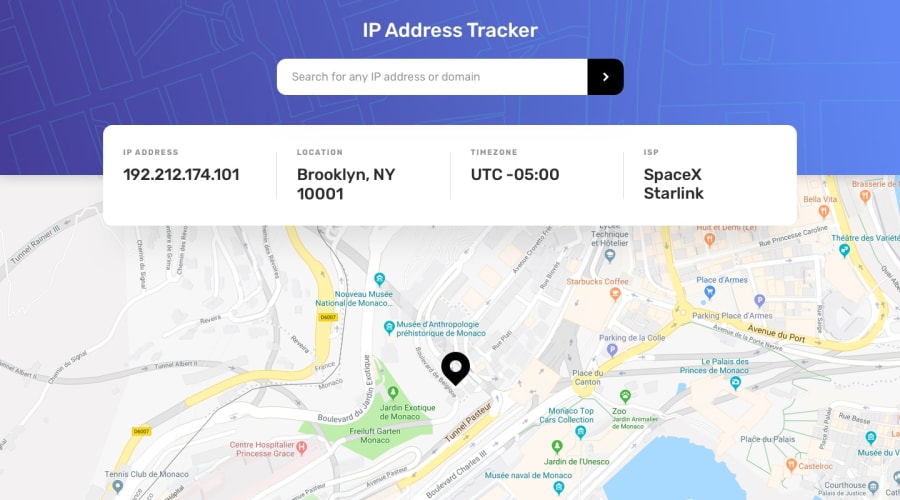
Design comparison
SolutionDesign
Solution retrospective
Had a hard time adjusting the header positioning and spacing. Didn't manage to get it 100% right. Feedbacks are welcome!
Community feedback
- @Yemisrach15Posted about 2 years ago
Hi Felipe, you did a good job with this challenge! A few suggestions I think might help,
inputelements should be inside a form.- The
#img-submitdiv should be a button as it's interactive. Or<input type="submit" />. - Instead of
.header-wrapper > * {
  transform: translateY(+20%);
}
you could add the following code to
.header-wrapper__resultsince it's the only section that needs to be shifted up..header-wrapper__result { position: relative; top: -40%; // adjust this }I think this article might be helpful. Keep coding :)
Marked as helpful0
Please log in to post a comment
Log in with GitHubJoin our Discord community
Join thousands of Frontend Mentor community members taking the challenges, sharing resources, helping each other, and chatting about all things front-end!
Join our Discord
