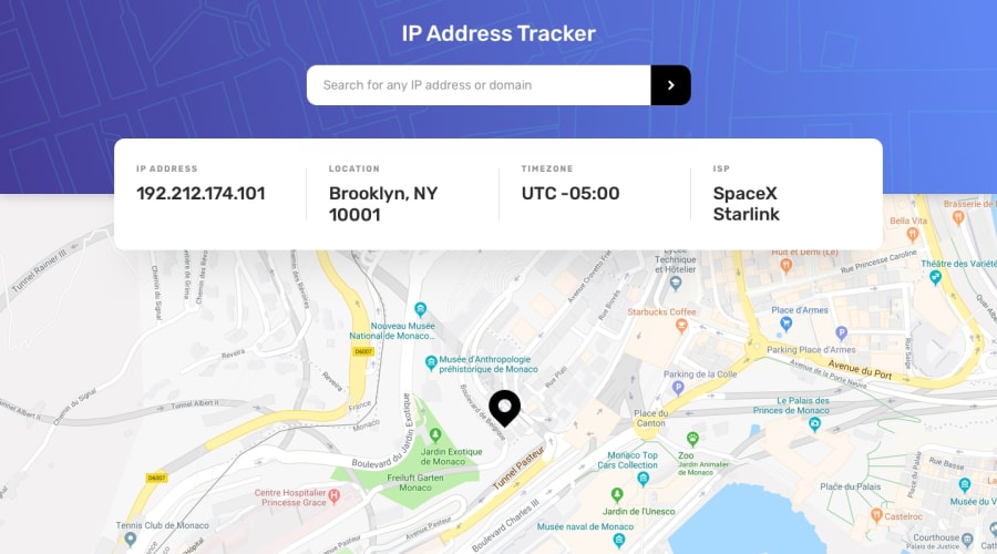
Design comparison
Solution retrospective
It was a great opportunity to learn about consuming a API. Feel free to share with me any advice to improve my code.
Community feedback
- @BasharKhdr1992Posted over 2 years ago
Good job on coding this out. However, there is a design flaw in your solution, where the info section is floating over the input element which makes it difficult for the user to see what he/she is typing. Also, the marker which indicates the location does not show on the map when after you have fetched the information.
Marked as helpful0@gilcllysPosted over 2 years ago@BasharKhdr1992 Thank you.
About the marker, i dont know what is happening, because sometimes it's appear and in a another moments not, so at the moment i didn't find an explanation for it
0
Please log in to post a comment
Log in with GitHubJoin our Discord community
Join thousands of Frontend Mentor community members taking the challenges, sharing resources, helping each other, and chatting about all things front-end!
Join our Discord
