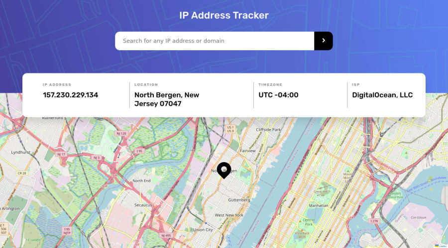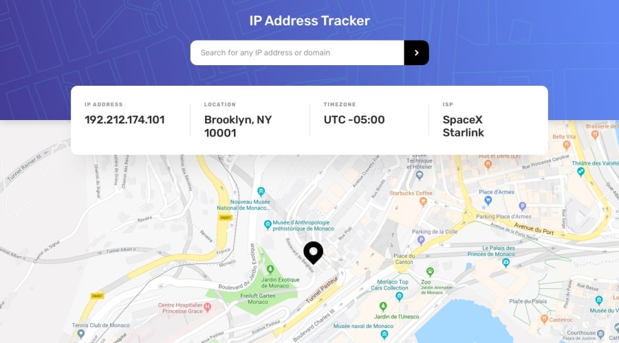
Design comparison
SolutionDesign
Solution retrospective
I am not good at UI/UX at all. When the user inputs an invalid IP or domain, I added a box showing the error with a crying face. The design of this box can be improved tremendously, but I do not know how to do it.
Besides, any other feedback is welcome too. Thanks!
Community feedback
Please log in to post a comment
Log in with GitHubJoin our Discord community
Join thousands of Frontend Mentor community members taking the challenges, sharing resources, helping each other, and chatting about all things front-end!
Join our Discord
