Invoice App, React, Redux and styled Components


Design comparison

Solution retrospective
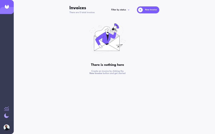
Hello everyone, I would like to share my invoice project, I decided to innovate and add a graph screen on my own, one based on the amount of invoices per status and the other based on the monetary value per status, and so far this has been my project with a higher level of difficulty than Frontend Mentor, in it I used Redux and I could see in practice the benefits of saving the data in a global state, I also decided not to use external libraries in the creation of components, nor in the creation of graphics, my biggest The challenge was creating the pie chart, where I used the conic-gradient property to separate the colors. I used the percentage of each status and transformed it into degs from 0 to 360. Then, I created a function to identify which part of the graph the user has the mouse over, based on the degs, to show a corresponding tooltip.
feedback is welcome!
Community feedback
Please log in to post a comment
Log in with GitHubJoin our Discord community
Join thousands of Frontend Mentor community members taking the challenges, sharing resources, helping each other, and chatting about all things front-end!
Join our Discord