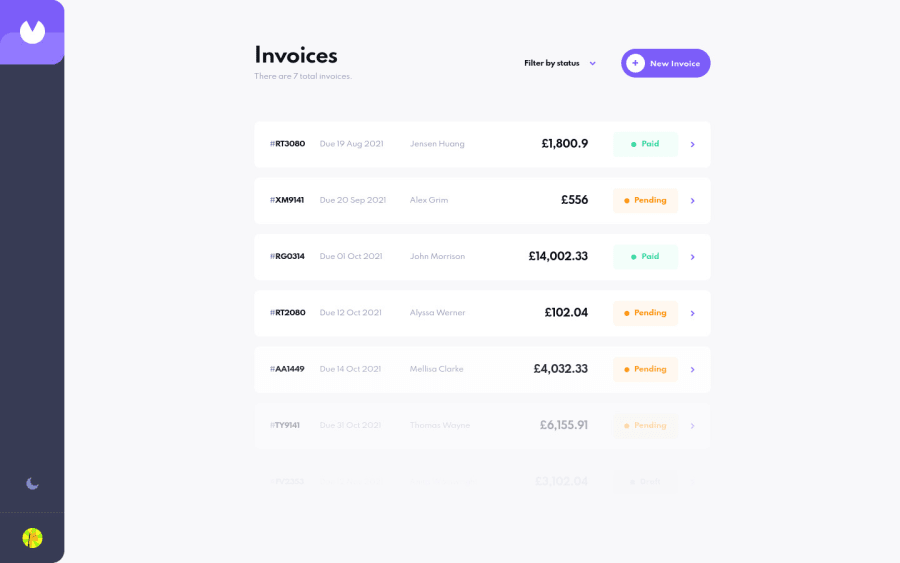
Invoice App | React, Next.js, styled-components, Formik, Framer Motion
Design comparison
Solution retrospective
Hello, everybody! 👋
This is my 30th solution on Frontend Mentor! 🎉 (And my first Guru level challenge submission.) 😎 This was definitely a tricky challenge, but I got to learn and try out many new things! 😀
I used React and Next.js to build the site, styled-components to style it, Formik (and Yup) to handle the forms in this challenge, and Framer Motion to add some page transitions and animations. 😄
There were quite a few things I had to learn in order to complete this challenge, and I'm not sure if I did them all correctly. 😥 Looking back, there are a few things I wish I would have differently, but it's a learning experience! 🙂
If anyone could share some resources on how to manage and organize larger projects like this, I'd really appreciate it! 👍 Lots of resources that I find only focus on specific things (like creating a popup or using certain features of a tool) and not so much how to approach and think about an entire app. 🙃
If you'd like to learn more about my project, see the README in my Git repo (where I also list a few quirks in my solution).
Feedback welcome and appreciated! 😊
Happy coding! 😁
BTW, click on the sidebar avatar for the attribution.
Community feedback
- @mattstuddertPosted over 3 years ago
Hey APG,
Congrats on completing your 30th (!!) challenge overall and your 1st Guru level challenge! I'd agree with Em and say this is your best one yet (although you've posted lots of brilliant solutions!) 🎉
Here are some thoughts related to some of the bugs and issues you mentioned in your
README.md
:- You can use lots of different approaches to structure React applications, as I'm sure you've noticed! On Frontend Mentor, I use an altered version of a domain-driven architecture. This is mostly because we use Redux for state management. If I were starting fresh today, I'd probably go a different route. The way you've structured your code works well for this size project, though. It's easy to navigate, you've separated the components nicely, and you've created good utility functions.
- I'd agree that using CSS custom properties instead of using Styled Component themes is a better approach. I'm feeling this pain on the Frontend Mentor codebase and will look to refactor at some point!
- The quick flash of light will most likely come from the fact that the app needs to pull the state from
localStorage
. So it's partially rendered by the time it can read the state. In a typical app where you're pulling data, this configuration would be stored as a user preference in the database. This means it wouldn't have the flash, as everything would be set during server-side rendering in Next.js. That might not be the issue, but that would be my guess anyway. - You're right about the custom dropdown not being accessible. As it is, the focus never goes into the dropdown if navigating by keyboard. This is because you've got
display: none;
on theinput
elements. Instead, I'd recommend using a.sr-only
class to visually hide the checkboxes and keep them accessible to screen readers. Here's a good article from the A11y Project about visually hiding content to learn more.
After looking at your code, here are a few recommendations:
- Now that optional chaining in JS is a thing, you don't need to use the
&&
operator so much. That means this line:filteredInvoices && filteredInvoices.length === 0
could become thisfilteredInvoices?.length === 0
. - You're using a
div
withspan
elements to display the invoice page's addresses. Instead, you could add more context in the HTML by using theaddress
element. You can read more about the address element on MDN here. - You could add the media query breakpoints to your theme. Seeing as they're used throughout the app, this would reduce duplication of values.
It's awesome to see you adding animations and extra details like the attribution overlay. Your attention to detail is incredible!
A couple of feature suggestions I'd love to see would be:
- Try making the form disappear if someone clicks away from it instead of always needing to click the buttons at the bottom.
- I know this wasn't in the design, but you could remove the "Mark as Paid" button from invoices that have a "Paid" status.
Overall, you've done an AMAZING job on this challenge! Especially considering you're still new to React and this was your first time using most of these packages.
Keep up the brilliant work! 🙌
Marked as helpful5@ApplePieGiraffePosted over 3 years ago@mattstuddert
Thank you so much, Matt! 🤩 This helps a lot! 👍
I 100% agree with everything you said and I'll look into all of those points and try to learn from them! 😊
1 - @omarelbastawesyPosted over 2 years ago
This is an excellent job. Keep coding.
1@ApplePieGiraffePosted over 2 years ago@omarelbastawesy
Thank you very much! 😀
0 - @fidellimPosted over 3 years ago
Wow! Hello ApplePieGiraffe!
Amazing work! Hopefully, I'll be to create complex projects like this one too! I'll bookmark it for future reference too :) Thank you!
1@ApplePieGiraffePosted over 3 years ago@fidellim
Thanks, Fidel Lim! 😀 Keep coding! 👍
1 - @ecodolphinPosted over 3 years ago
Hey, APG!
I'm just reading here throw all the above feedback, and it's so warm and inspiring, also like overall community here. It's very valuable experience to have a touch with such folks like you, thanks for that :)
I'm pretty new here, try out your app something, and have a small question. Is it suggested any validation on form fields content? I just tapped my keyboard randomly a lot and just three fields produce some warnings, actually number data fields (so, I typed into those fields very big numbers, my invoice had a price over 10e+40 though...), and also e-mail field. Also my colleague told me a story, when he while testing the web app sent around 2Gb strings in authorization forms :D So, is it suggested such kinds of validation mechanisms to apply into Frontend Mentor challenges, or is it an overhead for this type of tasks and not suggested here?
Happy coding :)
Edit: here are some pictures with artifacts of such an irresponsible input :D https://drive.google.com/drive/folders/1DWqMXkqhrISK1GLCX2N2tE8rEul9wNcC?usp=sharing
2@ApplePieGiraffePosted over 3 years ago@ecodolphin
Hey, there! Thanks for the feedback! 😀
I did add some basic form validation to the forms in this challenge (like to make sure that data of the correct type is entered into each form field), but I don't think I considered what would happen if a user entered really long numbers. 😅
Most of the Frontend Mentor challenges come with a README that outlines the basic steps and goals for the challenge, but if you want to add any other details then you're more than welcome to! 😉 Of course, taking care of any issues that you find in your solution (such as this one) is encouraged.
But solutions aren't usually perfect (like mine)—so thanks for pointing this one out! 😊
1 - @emestabilloPosted almost 4 years ago
This is excellent APG! I think it's your best one yet. Great attention to detail. Smooth transitions and I like the little extras, like the number of invoices on the browser tab and the surprise when clicking on your avatar 😀 Hopefully someone comments regarding architecture since I'm curious about that as well. Filter works perfectly for a single category, my feature request would be to add for multiple categories lol :-)
2@ApplePieGiraffePosted almost 4 years ago@emestabillo
Wow! Thank you so much, emestabillo! 😊
I actually initially thought of allowing multiple filters to be selected on the home page, but I changed my mind for some reason after looking at the design files. But I do agree that's a good idea! Thanks! 😀
1 - @BurritoDoggiePosted almost 4 years ago
hello APG!
I love the cool animations and you also did an excellent job!
Keep Coding!
(@@) \__/
2@ApplePieGiraffePosted almost 4 years ago@BurritoDoggie
Thanks, BurritoDoggie! 😀
1@tesla-ambassadorPosted over 3 years ago@ApplePieGiraffe Sorry I am late, with my response but I must say this is very great work. You have really done it bro! I love everything about it and just as you guessed... the first thing I did was switch to dark mode 😂 Anyways, Cheers man! Happy coding (...and Keep on coding too!)😎
2@ApplePieGiraffePosted over 3 years ago@tesla-ambassador
Haha, thanks, dude! 🙌
1 - @SteentoonsPosted over 3 years ago
Wow!! This is so awesome.
You did a fantastic job from the animations to the light and dark themes to the filters and responsiveness. I will definately take time to learn how all this was achieved from your repo. And congrats for submiting your guru solution.
1@ApplePieGiraffePosted over 3 years ago@Steentoons
Thanks so much! 😊 I hope you can learn a thing or two from looking around. Happy coding! 😀
0 - @karenefereyanPosted over 3 years ago
I'm stuck on your projects. Amazing stuff. I love the way you document them on github. Gave me some ideas. I've been curious about the dark theme switch thingy. Will take time to study how you achieved the functionality. Maybe you could apply margins to the filter options to make it more breathable and easily distinguishable
1 - @yasssuzPosted over 3 years ago
Hey ApplePieGiraffe!
I'm working on the same project and I will submit it in a few days. Your build is awesome, it's very responsive and reactive. However, using react dev tools, I saw that a lot of re-renderings happening on your application, mostly from components on your Invoice page. So I started looking at your code and I saw that you're not using memo or useCallback on your functions and components. What's happing is that every time the state of your parent element changes, all the components are going to re-render again, even if they don't need to re-render. If possible, I would like to copy your repo and create a solution for this problem. Let me know if I can, and maybe, we could work together to solve this problem!
Thanks for your time and happy coding :)
1@ApplePieGiraffePosted over 3 years ago@Galielo-App
Hi, there!
Yes—that's totally fine! Feel free to fork the repository and play around/change stuff. Thanks for taking a look and mentioning that issue. I'm still learning a lot about React, so any suggestions and improvements are welcome! 😊
Happy coding to you, too! 😀
1@yasssuzPosted over 3 years ago@ApplePieGiraffe
awesome!
In a few days, I'm gonna copy the repo and when the job is finished I'll create a README.md with all the changes I made, all the problems I solved and how everything works so you can learn new important things as a react developer :)
Thank you again and happy coding!
1@ApplePieGiraffePosted over 3 years ago@Galielo-App
Thanks, Galielo! I'll be looking forward to that! 😀
1 - @astroudPosted over 3 years ago
Well done ApplePieGiraffe! I just got out of the hospital, so I don't have time to dive in to your code, but I've bookmarked it for future reference.
1@ApplePieGiraffePosted over 3 years ago@astroud
Thanks Aaron! 👍 Hope you're doing okay, now! Take care! 🙂
1 - @infinity7998Posted over 3 years ago
This is soo neat! APG, I'll use your site as the inspiration for the animations. This is phenomenal work!!! <3
FWIW, I'm currently working on this project and have made it into a full stack app with React/Nextjs and Fauna (including authentication and with plans to turn it into a SaaS). I'm looking forward to deploy it in a few weeks.
1@ApplePieGiraffePosted over 3 years ago@infinity7998
Thank you! 😀
And good luck with your project! 👍
1 - @brasspetalsPosted over 3 years ago
Hey, APG! Congrats on your 30th solution! 🥳🎉
I'm nowhere near the point where I could give this a proper critique, and it seems like you've already gotten some amazing feedback, so I guess I'll just pile on the praise bandwagon! 😄
The animations and transitions are fantastic as always - the UX feels great. I know you've utilized various versions of the attribution button/avatar in previous projects, and it remains a great touch (and something I might have to steal!).
Definitely bookmarked for reference. 👍 Looking forward to the next one!
1@ApplePieGiraffePosted over 3 years ago@brasspetals
Thanks as always, Anna! 😊
Your solutions remind me to pay extra-careful attention to detail (which I tried to do). 😅
I'm very happy to hear the UX feels great for you and that you liked the attribution! 😉 I thought a bunch about those things and really hoped they would come out well! 🤞
1 - @SarahHenriettePosted over 3 years ago
Hey ApplePieGiraffe 🙂 !
Congratulations, the project is just on top ! Respect👏.
1 - @samuelpalaciosdevPosted almost 4 years ago
Hi, ApplePieGiraffe👋
Congratulations, another amazing solution from you (as expected). I love the soft and cool animations you used. Your work impresses me, again, congratulations, mate ;).
Keep coding🧡
1 - @DrallasPosted almost 4 years ago
Hello APG
This is a great version of the Invoice App, i couldn't find big issues playing with the invoices and testing the responsive layouts.
Only thing i noticed is that the new invoice animation vs edit invoice animation are at different speeds. To open and close an existing invoice takes a bit long... but the animations are sweet! :)
Looking forward to solve this challenge myself someday.
1@ApplePieGiraffePosted almost 4 years ago@Drallas
Thank you, Drallas! 😀
I actually have the same animation playing for both forms, so it's interesting that opening/closing an invoice seems to take a little longer than a new invoice... thanks for letting me know! 👍
0 - @didyouseekyngPosted almost 4 years ago
Honestly I really admire your work, especially what you do with animations, I'm getting there someday and you're juss motivating me to get there. I love the dark and light theme, well done APG!! Mobile design is pretty solid.
1@ApplePieGiraffePosted almost 4 years ago@didyouseekyng
Haha, thanks, didyouseekyng! 😀
I'm glad to hear the mobile layout is working well since that's something I was a little anxious might be buggy! 😅
0
Please log in to post a comment
Log in with GitHubJoin our Discord community
Join thousands of Frontend Mentor community members taking the challenges, sharing resources, helping each other, and chatting about all things front-end!
Join our Discord