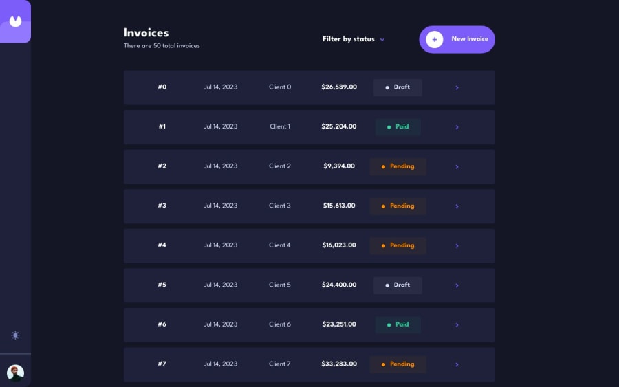
Invoice App Angular, Tailwind CSS, RxJS
Design comparison
Solution retrospective
With this project I used only RxJS BehaviourSubject for handling states, could anyone please guide if this can work for large projects? (I am not able to figure out the use case for ngrx or will I eventually switch to ngrx?)
Thanks
Community feedback
- @webguy83Posted over 1 year ago
Hi Parth, good effort on this beast of a project. Don't worry about the need for NGRX as it's only needed when RXJS solutions aren't good enough. This happens when applications get to enterprise level. Usually then it's best to look into NGRX so need to pursue it on these challenges.
I just finished doing this project too and I wanted to share some things I noticed when seeing your app:
- on my mobile device the layout breaks pretty bad especially when displaying the card. Text is crashing into each other
-it also breaks on the detail invoice view. If you see the Figma they do something quite different on mobile. Perhaps look at a responsive solution for that. In Angular I would advice you use the Breakpoint service to dynamically inject classes on breakpoints. You can look it up in the docs.
-
I didn't even see a Mark as Pending button on mobile view as it was cut off completely. This was only visible on desktop. A mark as pending button isn't needed anyway. Anytime a user saves and submits a form it goes to pending always.
-
they mention ids on the cards should be 2 numbers followed by 4 letters. Using the index array value isn't a good solution for ids and can be a real source of bugs
-
when the slidenav section is out it creates two scroll bars one on it and one behind. I even saw the header scroll down and the content behind the slideout nav was showing from behind it. Very visible from mobile view.
-
in your form instead of Payment Due you can just use Payment terms selection box and it to the invoice date to calc the payment due. On a sidenode for your Angular Material calender you can inject your colour themes into it. I recommend using Angular Material theming for the colours. It is amazing.
-
your form needs validation messages for invalid email, forms not having content, etc
-
I also noticed tons of vw being used on widths as well. This could be the source of your issues on mobile device. It's always best to avoid using vw for pretty much everything and never use hard coded widths at all like px, rem, em, etc.
You can look up Kevin Powell on YouTube as he has some amazing tutorials on fixing responsive issues. All the best!
Marked as helpful0@parthmanhasPosted over 1 year ago@webguy83 Hi Curtis, thankyou so much for your comments!! I just found out that now I need to test these applications in actual devices always.
I was building according to firefox responsive design in desktop but for the same window.innerHeight and window.innerWidth the layout somehow breaks on actual device but not on firefox responsive mode(mobile mode) in desktop (good learning for me!).
And I will be fixing the application according to your comments!
1
Please log in to post a comment
Log in with GitHubJoin our Discord community
Join thousands of Frontend Mentor community members taking the challenges, sharing resources, helping each other, and chatting about all things front-end!
Join our Discord
