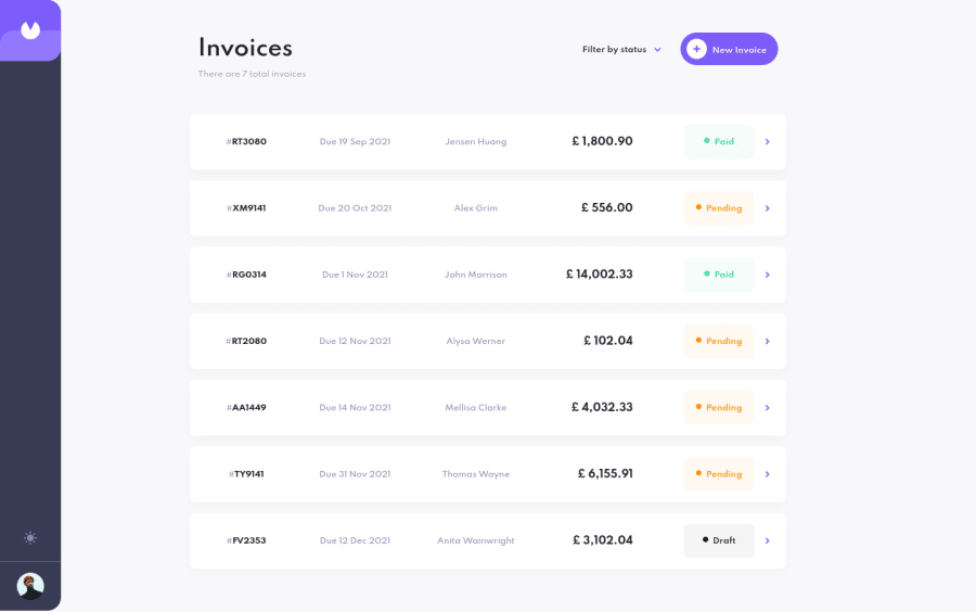
Design comparison
Solution retrospective
Simple on the surface, taking just a bit longer than I thought to complete. I found that the forms here were quite dynamic and required extra attention to get right.
Also, the toggle between light/dark mode was a new functionality for me that I hadn't implemented before. Overall, I am glad to have gotten through this project, and grateful for the things I've learned!
Notes in retrospect:
• The only major concern, or element that I am still ~ iffy on is accessibility. While I did part to tackle features as best I could, I can imagine that I am still missing crucial parts. If such might the case, I hope to return and make edits where possible.
Thank you again for viewing!
Community feedback
- @AlbertoDeMariaPosted about 1 year ago
Wow for a junior developer like me that's amazing! The only thing I can suggest is that right now if I try to click on your profile pic. for some reason the the theme switch mode. Hope this could be usefull!
Good life :)
0
Please log in to post a comment
Log in with GitHubJoin our Discord community
Join thousands of Frontend Mentor community members taking the challenges, sharing resources, helping each other, and chatting about all things front-end!
Join our Discord
