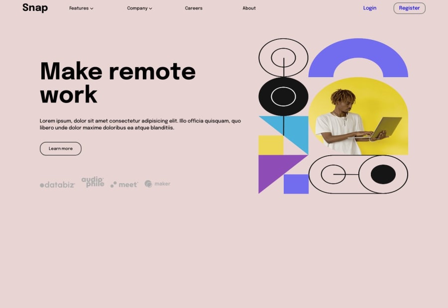
Design comparison
Solution retrospective
rate me please , any tips will be welcome
Community feedback
- @RoksolanaVeresPosted over 1 year ago
Hi, nice job! I've checked your solution and noticed a few things that can be improved. So here are some of my tips:
- Currently, you use the same image for desktop and mobile devices, but the design includes two separate images for different screens; you can use a picture element to make the image change depending on the screen size:
Here is how you can modify your HTML:
<section class="right">
        <picture>
          <source
            srcset="./images/image-hero-desktop.png"
            media="(min-width: 800px)"
          />
          <img
            src="./images/image-hero-mobile.png"
            alt="remote worker image"
          />
        </picture>
      </section>
Then in CSS remove height: 500px; from .right img and leave only width: 100%;
.right img { width: 100%; }- This one seems obvious, but I'll mention it just in case: to change the color of the links on the Login and Register buttons, you have to set this color directly to the links (right now your links have a default blue color):
.login ul li a { text-decoration: none; color: black; }- The background body color looks very different from that in the design; try this one: background-color: #fafafa; and instead of setting a fixed height to the body, you'd better set min-height: 100vh.
body {
  max-width: 1440px;
  min-height: 100vh;
  background-color: #fafafa;
}
P.S. There are some picture editors that may help you measure the size of elements in the design and find the most suitable color. I'm using PicPick currently, but there are a lot of similar tools to choose from.
- And the last thing: on smaller screens, the picture precedes the text and the text is centered. You can achieve this effect by setting the properties order: 2 and text-align: center; to your left container at @media (max-width: 800px)
In general, I suggest the following media queries (but obviously, you can do something different):
@media (max-width: 900px) {
  .left h1 {
    margin-top: 0;
  } // this one is just to make the text in line with the picture so that it doesn't look weird. But you can absolutely ignore it
}

@media (max-width: 800px) {
  main {
    grid-template-columns: 1fr;
    padding: 0;
    margin: 0.4em;
  }

  .left {
    order: 2;
    text-align: center;
  }

  .left h1 {
    font-size: 35px;
    margin-top: 45px;
  }
}
That's all for now 🙂Happy coding!
Marked as helpful0
Please log in to post a comment
Log in with GitHubJoin our Discord community
Join thousands of Frontend Mentor community members taking the challenges, sharing resources, helping each other, and chatting about all things front-end!
Join our Discord
