


Design comparison
Solution retrospective
I started the challenge not realizing I was unfamiliar with the dropdown menu. Well,
4 days of you tube tutorials + w3schhol while building this project.
On the navbar pop-up/drop-down button, I had never done any. The "easiest" part was the graphics. It's not exactly what the challenge calls for, a little color I think goes a long way. Are we developers or robots? Improvements in progress...
Criticism welcome, I'm not offended and I'm not fickle.
Community feedback
- @pradeeps4iniPosted over 2 years ago
Hey, MioMauro. I hope you had lots of fun and learning while completing the project. I really like how you implemented your own elements in the project.
I have some suggestions that i think would make the site a little better.
-
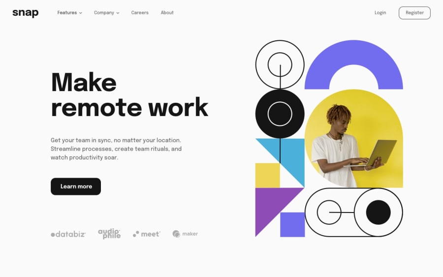
Paragraph " Get your team in sync, no matter your location. Streamline processes, create team rituals, and watch productivity soar." is difficult to read because of the background color and the font color. May be change the font color to some other color, which will make the text easier to read.
-
Use flexbox property "align-items:center" to center the nav bar vertically. And also remove the margin-top from it.
-
In the logos section. You don't have to use <divs>. You could use <img> tags only. This way you won't have to align them horizontally. They would be automatically aligned horizontally. <img> are inline elements.
Some suggestions from another beginner like you. Have fun learning.:)
Marked as helpful0@MioMauroPosted over 2 years ago@pradeeps4ini Hi, thanks for the tips, I took note, and I find them useful. Many thanks again!
0 -

Please log in to post a comment
Log in with GitHubJoin our Discord community
Join thousands of Frontend Mentor community members taking the challenges, sharing resources, helping each other, and chatting about all things front-end!
Join our Discord