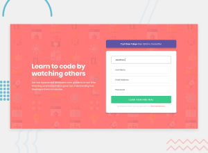
Design comparison
Solution retrospective
This time I used normal divs instead of cards that is why it was tough for me to make it responsive like two divs were not stacking on top of each other when it comes to mobile width I think I need to clear more concepts of grid system and flex box Any feedback is highly appreciated
Community feedback
- @hardy333Posted about 3 years ago
Hey nice solution, everything looks good and clean.
But there are some issues design wise:
- Try to use less intensive box shadows on form
- use background-image on body element or container with stretches the whole screen... otherwise there are white space between browser edges and your background image.
Good luck.
Marked as helpful4@maliksulemanaslamPosted about 3 years ago@hardy333 Hi thank you for suggesting me these concepts to improve myself. I am glad to learn from you
0 - Account deleted
At first glance it looks good but I don't know why you are not making it take the whole space and leaving those empty spaces around it. On mobile it needs to be centered.
Marked as helpful1@maliksulemanaslamPosted about 3 years ago@thulanigamtee Exactly i have worked on many other challenges but this time it is not centered on mobile if it is possible kindly have a look at my code and suggest me to improve myself in future I might be constructing this one again thanks :)
0
Please log in to post a comment
Log in with GitHubJoin our Discord community
Join thousands of Frontend Mentor community members taking the challenges, sharing resources, helping each other, and chatting about all things front-end!
Join our Discord
