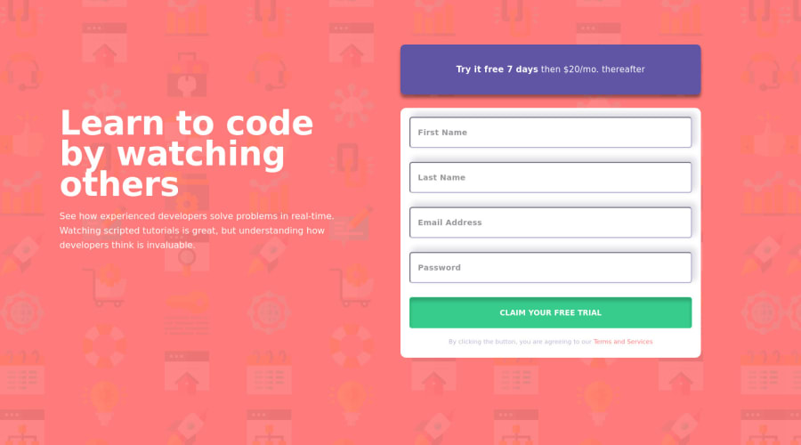
Design comparison
Solution retrospective
Found it difficult making my show error JS code DRY but this was a great learning experience.
I would like some feedback on this.
Thanks
Community feedback
- @vanzasetiaPosted over 2 years ago
Hello, Leonard! 👋
It looks very different compared to the design especially considering that you are a PRO member. I recommend trying to make the site looks more similar to the design.
Some more feedback from me.
- The error icons should be a
background-imageon theinputelement instead of animgelement. This way, when the input is in the invalid state, you can show the error icon with CSS instead. - Worth mentioning that every
imgshould havealtregardless that it is a decorative image or informative image. - The button element should have
typeofsubmit. Also, it's best to always specify thetypeof thebuttonelement. It's going to prevent the button from behaving unexpectedly. - I recommend breaking down the function into smaller functions. This way, it is much easier to maintain the JavaScript.
- Use
pelement for the error message instead ofdiv. Always use a meaningful element to wrap text content.
Now, to make the screen readers pronounce the alert message you can do the following.
- Add
aria-liveattribute to each error message - Add
idfor each error message - Add
aria-describedbyattribute to each input. The value is pointing to theidof the error message. - I recommend toggling the
hiddenattribute within the JavaScript to show and hide the alert message.
You can visit MDN documentation for more information about
aria-liveandaria-describedby.That's it! I hope this information is useful!
Marked as helpful0@leoimeworePosted over 2 years ago@vanzasetia Thanks i will keep working on improving. Nice feedback.
0 - The error icons should be a
- @isprutfromuaPosted over 2 years ago
Hi there. You did a good job 😎
keep improving your programming skills🛠️
your solution looks great, however, if you want to improve it, you can follow these recommendation:
**HTML**✅ Set a meaningful img alt attribute. It’s best practice for SEO purpose.
<img class="icons" src="images/icon-error.svg">✅ Avoid complex wrapping. For better performance please tried to avoid unnecessary wrapping. It will create unnecessary node in your HTML tree and reduce performance too.
    <div class="promo-ad">
      <p><span class="trial">Try it free 7 days</span> then $20/mo. thereafter</p>
    </div>
✅ Write Code Comments. It’s best practice to write human-readable code. Tried to comment your block of code. It will help you or any other developer to refactor the piece of code blocks.
**CSS**✅ Use a CSS reset . By default, browsers don’t apply the same default styling to HTML elements, a CSS reset will ensure that all element have no particular style. For example: css-reset
✅ Write consistent CSS. At the beginning part of the project you can set some rules for maintain throughout to your entire stylesheet. If you follow the convention or BEM, you’ll be able to write CSS without being afraid of side effects.
identifiers

#error-firstname,
#error-lastname,
#error-email,
#error-password

classes
.icons
.container


tags
.form-control.success input {

    border:3px solid var(--primary-Green)
}

.form-control.success div {
    visibility: hidden;
}

.form-control.error input {
    border:3px solid var(--primary-Red)
}
.form-control.error img {
    visibility: visible;
}
✅ Use rem’s or em’s. Using rem’s or em’s is more dynamic way instead of using pixels. Try to use rem’s or em’s rather than pixels.
h1 {
  font-size: 28px;
  font-weight: 700;
  line-height: 36px;
  letter-spacing: -0.2916666865348816px;
  color: #fff;
  margin-bottom: 16px;
}

p {
  font-size: 16px;
  font-weight: 500;
  line-height: 26px;
  letter-spacing: 0px;
  color: hsla(0, 0%, 100%, 1);
}
✅ Avoid Extra Selectors. Adding extra selectors won't bring Armageddon or anything of the sort, but they do keep your CSS from being as simple and clean as possible.
.form-control.success input {

    border:3px solid var(--primary-Green)
}

.form-control.success div {
    visibility: hidden;
}

.form-control.error input {
    border:3px solid var(--primary-Red)
}
.form-control.error img {
    visibility: visible;
}
✅ Use Clamp . The clamp function make smaller and simple CSS to control element width.
width: clamp(100px, 50%, 300px);I hope my feedback will be helpful. You can mark it as useful if so 👍 it is not difficult for you, but I understand that my efforts have been appreciated
Good luck and fun coding 🤝⌨️
Marked as helpful0@leoimeworePosted over 2 years ago@isprutfromua thank you very much for this elaborate feedback. I sure will follow up on this.
Thanks
0@isprutfromuaPosted over 2 years ago@leoimewore I'm glad that my comment was helpful to you.
Contact me if you have any questions
Cheers
0
Please log in to post a comment
Log in with GitHubJoin our Discord community
Join thousands of Frontend Mentor community members taking the challenges, sharing resources, helping each other, and chatting about all things front-end!
Join our Discord
