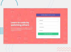
Design comparison
Solution retrospective
With attention-to-detail, I aimed to create an exact-looking form, which I think I have achieved, and I am really happy about it.
Additionally, I have added a touch of personalization and incorporated animated labels for each input field. These labels smoothly transition when clicked, elegantly moving above the input field to provide context. If the input field is left empty, the label gracefully animates back to its original position, maintaining a polished user interface.
Furthermore, I introduced a 'show password' feature for enhanced security and convenience. By clicking an eye icon adjacent to the password field, users can toggle between revealing and hiding their password. The icon dynamically updates its appearance, cleverly displaying a slash when the password is visible, providing users with clear feedback and control over their input.
What challenges did you encounter, and how did you overcome them?Changing the border colors and displaying the error messages seemed a bit tough, but I figured them out.
What specific areas of your project would you like help with?If anyone could review my JavaScript code and give me feedback on how I can get better at writing optimized code, that would be really helpful.
Also making sure that my webpage is responsive.
Community feedback
Please log in to post a comment
Log in with GitHubJoin our Discord community
Join thousands of Frontend Mentor community members taking the challenges, sharing resources, helping each other, and chatting about all things front-end!
Join our Discord
