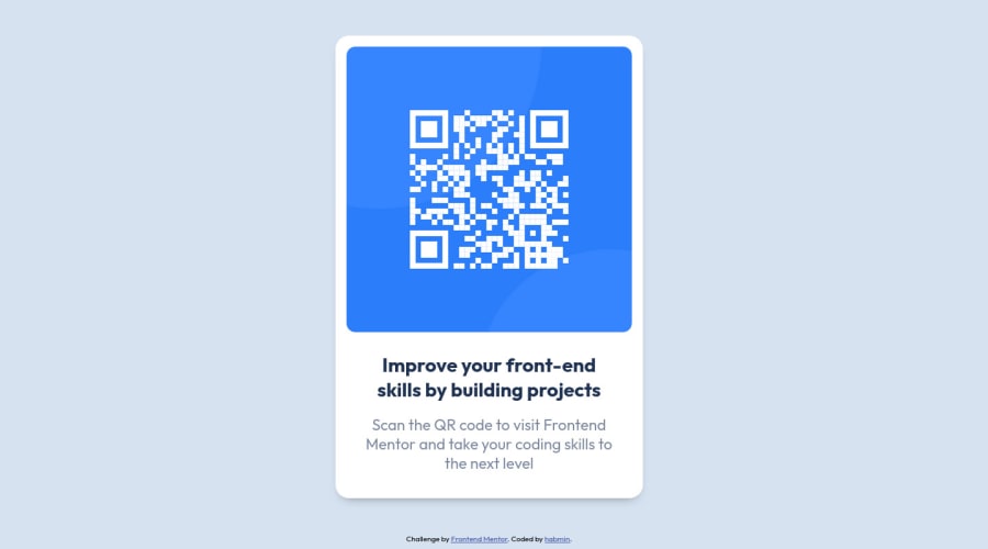
Design comparison
Solution retrospective
Thanks for checking out my submission!
-
One big problem I ran into is that I couldn't seem to get the resize the QR img when resizing the window's height. Even with getting the parent container to change dynamically, the image would just overflow. This wasn't a problem resizing the width though. Any tips on that would be appreciated.
-
Also, if there's any other tips into either creating a more efficient code, or better best practices, let me know! Thanks!
Community feedback
- @vanzasetiaPosted about 2 years ago
Hi, Henry Andrew Baum! 👋
For the image, you only need to make it as a block element and set
max-width: 100%. After that, you can remove the rest of the styling.You don't need to wrap the QR code with the anchor tag.
You should make the "Improve your front-end skills by building projects" text the first level heading.
I recommend making the
<main>element as the card element. This way, you don't need an extra<div>for it.Don't use
idselectors for styling. There are two reasons for not using ID’s to style content:- They mess up specificity because they are too high (the most important reason).
- They are unique identifiers. So, they are not reusable on the same page.
Learn more — What the ID attribute is REALLY for
Use a CSS reset whenever you start a new project. This can help you set the styling foundation easily. My recommendation — A Modern CSS Reset | Andy Bell
I hope this helps. Happy coding! 👍
Marked as helpful1
Please log in to post a comment
Log in with GitHubJoin our Discord community
Join thousands of Frontend Mentor community members taking the challenges, sharing resources, helping each other, and chatting about all things front-end!
Join our Discord
