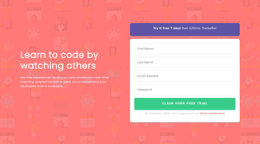
Design comparison
Solution retrospective
Hi guys,
I still have struggles with flexbox-positioning. With regard to <div class="container signup-proposal"> and <p class="signup-proposal-txt">: I failed (again) to center the flex-item (<p>) on the x- and y-axis with justify-content: center; and align-items: center; I also tried align-content: center;. So maybe there is someone who can explain to me the issue and can give me some advices.
Another task was to provide an error message when the submitted email address ist not formatted correctly. I also still looking here for an appropriate solution.
Thank you for your support.
Kevin =)
Community feedback
- @cr1deg0Posted over 2 years ago
Hi Kevin,
Good solution, well done!
It looks like your <p> element has some bottom margin applied to it, you can try by adding:
.signup-proposal-txt { padding: 1rem 0; margin: 0; }
You may want to have a look into the desktop version media query. You currently have the breakpoint as min-width: 1440px and it seems too tight, as the page is loading with the mobile layout for me (browser window size just short of 13.3inch). I would try something smaller, perhaps min-width: 1000px;
Hope it helps!
Marked as helpful0 - @CarvalhoVincentPosted over 2 years ago
Hi, this looks good.
- For your issue, you can use same margin or padding for top and bottom, like:
p { padding-top: .5rem; padding-bottom: .5rem; } or p { margin: .5rem 0; }- For the mail format, you can use a pattern, like this :
<input type="email" id="mail" placeholder="Email Address" required pattern="[a-z0-9._%+-]+@[a-z0-9.-]+\.[a-z]{2,}$">Hope this is helpful. Happy coding !
Marked as helpful0
Please log in to post a comment
Log in with GitHubJoin our Discord community
Join thousands of Frontend Mentor community members taking the challenges, sharing resources, helping each other, and chatting about all things front-end!
Join our Discord
