

Design comparison

Solution retrospective
Still learning grid
Community feedback
- @elaineleungPosted about 2 years ago
Hi Paula, well done here in practicing what you learned! 🙂 In terms of feedback, I just have some quick comments:
-
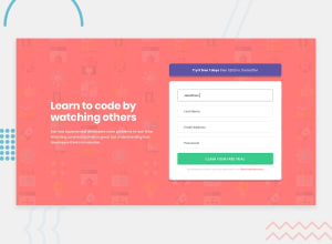
I think this was done well on the whole, especially in using grid areas! For the desktop view, instead of separating each item, I probably would have grouped the title and description together. This way, it might be possible to make the text part vertically centered in relation with the form like the design.
-
Right now at around the breakpoint before the mobile view changes to desktop view, the form is looking pretty big! Instead of using just
width: 87vwfor the width in the main container, trywidth: min(87vw, 600px)so that the container won't stretch past a certain width, which in my example is 600px, but you can change that to your liking. Same thing goes for the desktop view when the breakpoint occurs; you can try something likewidth: min(87vw, 1100px). -
I'm viewing this on an average-sized laptop (basically not a big screen), and at desktop view, the top part of the promo is touching the top of the window, so maybe you can try adding some margin to prevent the component from touching the browser sides.
Great work here, and keep going!!
Marked as helpful0 -

Please log in to post a comment
Log in with GitHubJoin our Discord community
Join thousands of Frontend Mentor community members taking the challenges, sharing resources, helping each other, and chatting about all things front-end!
Join our Discord