Design comparison
SolutionDesign
Community feedback
- @AngeloMar98Posted over 1 year ago
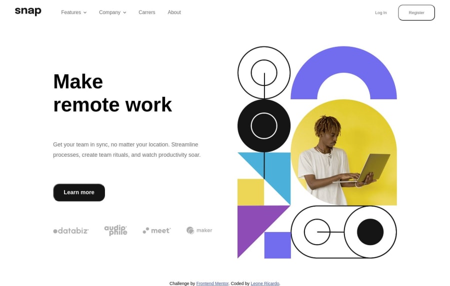
The image messes up the page a bit, I would suggest using max-width to handle it or leave it at width 100% but doing something with the container. You handled the change to the mobile img as I did, but the media query in the source element needs to be between parenthesis
1
Please log in to post a comment
Log in with GitHubJoin our Discord community
Join thousands of Frontend Mentor community members taking the challenges, sharing resources, helping each other, and chatting about all things front-end!
Join our Discord
