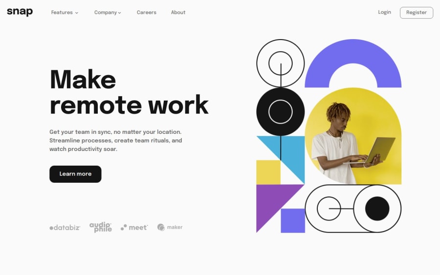
Intro section with hamburger menu and navigation bar
Design comparison
Solution retrospective
Hello FrontendMentor!
I finally completed this challenge, and I am glad how it works. My biggest accomplishment is to make the navigation menu work as I wanted, be responsive and even accessible. I struggled a lot on a lot of things as I am quite new to Angular, but I like the whole concept of this framework and planned to learn it, so here we are :D
I am still not satisfied with the structuring of the css files, but BEM is also new to me, so I think this is a good or at least not bad starting.
What challenges did you encounter, and how did you overcome them?- The biggest challenge was to make the navigation menu work both on touchscreens, mobile sized screens, and of course on desktop screens at the same time.
- And Angular in general. I think it's learning curve is a bit steep in the beginning. It's quite demotivating, but I hope the curve will flatten in some weeks or months.
As I am a beginner in Angular I would be glad to receive some feedback, tips on how to structure my assets folders, and in general how good or bad is the path that I am walking on ot learn this framework.
Community feedback
Please log in to post a comment
Log in with GitHubJoin our Discord community
Join thousands of Frontend Mentor community members taking the challenges, sharing resources, helping each other, and chatting about all things front-end!
Join our Discord
