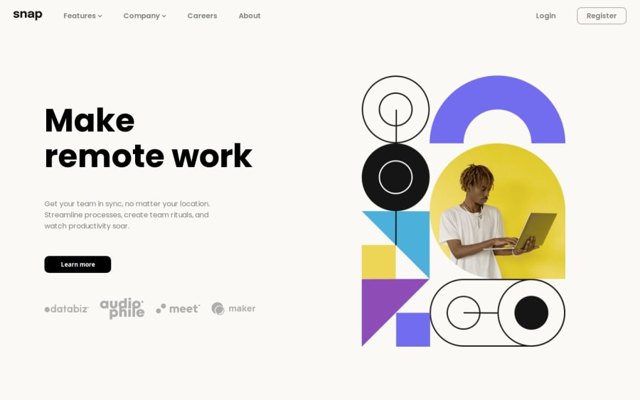
Design comparison
Solution retrospective
The thing that I'm proud the most of is that I managed to make the dropdown as well as the hamburger menu icon.
What challenges did you encounter, and how did you overcome them?How to think logically as a programmer.
What specific areas of your project would you like help with?Even though I managed to make the hamburger menu icon as well as the dropdown, the thing that I still am struggling is how to make the menu displays vertically when the hamburger menu icon is clicked. So, I leave it as that for now. Might come back to fix it in the future.
Community feedback
- @GuilhemJolyPosted 6 months ago
Hi Iceish96 ! I hope you had fun coding ! Here are some points that could be adjusted: Maybe you could use the colors that are present in the style-guide.md file to get a little closer to the design. To respect HTML semantics, you could also create a <header> including the <nav> . You could create <main> tags for the central part of the page.
Maybe you already know, but navigation doesn't work in mobile version.
Best wishes !
0
Please log in to post a comment
Log in with GitHubJoin our Discord community
Join thousands of Frontend Mentor community members taking the challenges, sharing resources, helping each other, and chatting about all things front-end!
Join our Discord
