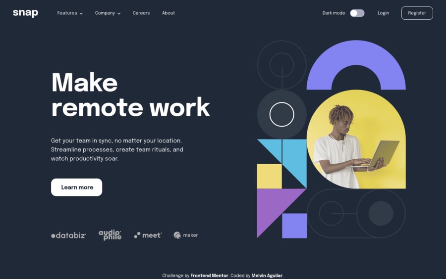
Intro section with dropdown navigation (React + Tailwind + Dark mode)
Design comparison
Solution retrospective
Hi there 👋, I’m Melvin and this is my solution for this challenge. 🚀
Help:
- Any resource or suggestion on how to create or improve the accessibility of a switcher theme component is welcome; although this is the code for my component, I will be grateful for any suggestions.
I added:
- 🌔 Light and Dark mode
- 🔧 Using localStorage to save theme preferences
Built With:
- React-JS
- TailwindCSS
- Yarn - Vite - Prettier
Any suggestions on how I can improve and reduce unnecessary code are appreciated!
Thank you. 😊✌️
Community feedback
- @aweliegoPosted almost 2 years ago
😍 What a brilliant and inspiring solution to this challenge!
I really love how you structured your project and that you really nailed the accessibility (something I need to work on). The transitions are really smooth and the dark mode is a great addition!
The only thing I noticed with the dark mode is that if I leave the site after switching to the dark theme, and then come back again, there is a slight delay for the dark theme to load, so it goes from light to dark really quick. But maybe that's something that you were able to solve with the advice in the first comment?
The responsiveness is top notch, although the layout could be a bit improved on tablet views imo. But I think you have some real styling chops here! I'm still trying to wrap my mind on how you handle the arrow icons and the direction they point at to be honest 🤯
And my last suggestion to make your solution even better would be to render the data more dynamically, as currently much of the menu text is hard coded. You do map over the menu items to create the links, but I would take it a step further and extract the data to a separate array, and refer to it where needed in your code. That way it's all easy to find in one place, and easier to maintain as well in the future should the menu grow.
But fabulous job overall, and I bookmarked your solution for future reference!
Marked as helpful1 - @karthik2265Posted almost 2 years ago
Hey melvin,
The solution looks good and the responsiveness is also pretty good.
a few things to note,
In the ThemeSwitcher Component
<input type="checkbox" className="m-t absolute top-0 left-0 z-10 h-full w-full cursor-pointer appearance-none" checked={darkMode} role="switch" aria-checked={darkMode} onChange={() => setDarkMode(!darkMode)} />
when calling the setDarkMode you should prefer to do it using a function since the state update depends on previous state.
<input type="checkbox" className="m-t absolute top-0 left-0 z-10 h-full w-full cursor-pointer appearance-none" checked={darkMode} role="switch" aria-checked={darkMode} onChange={() => setDarkMode((prev) => !prev)} />
this should be preferred because sate updates happen asynchronously, check out this resources for more details
using a function in setState medium article
stack overflow question about function in setState
The effect you are running for theme switching, this might affect perfomance as the app gets bigger
useEffect(() => { if (darkMode) { document.documentElement.classList.add("dark"); localStorage.setItem("theme", "dark"); } else { document.documentElement.classList.remove("dark"); localStorage.setItem("theme", "light"); } }, [darkMode]);
another way to do this would be to store the theme preference in an app wide state like Context API or redux store and use it in the components.
Overall good solution, well done 👏
Marked as helpful1@MelvinAguilarPosted almost 2 years ago@karthik2265 HI! Thank you so much for these suggestions, they are very helpful. I currently don't know much about Redux so I'm not using it, but I will definitely take it into consideration. Thank you again.
1 - @Deivid182Posted about 1 year ago
Wow bro! La manera en como estructuras tus proyectos y los haces lucir es impresionante, inclusive los que son sencillos como este. Me sirven de guía para estructurar mejor los míos. Excelente trabajo!
1@MelvinAguilarPosted about 1 year ago¡Muchas gracias por tus palabras!, @Deivid182 😊. Perdón por la demora, a veces tengo problemas con las notificaciones. ¡Sigue adelante con tus proyectos! 👍🚀
0 - @MultimarixPosted almost 2 years ago
Very Nice Chief👌🏾
1 - Account deleted
Amazing!
1 - @ajduetPosted over 1 year ago
This absolutely amazing. Your dropdown motion is quite unique. Great job!
0 - @MohmedElshaarawyPosted almost 2 years ago
then how do u manage that extension to the PC screen size . I had difficulty to use that my pc screen size is 1330px and the design is 1440 px so is there any trick to match the design and actual screen size in pixel perfect
0@MelvinAguilarPosted almost 2 years ago@MohmedElshaarawy What I do is use DevTools to simulate a device of those dimensions: Screenshot
1 - @Kritical719Posted almost 2 years ago
to do list its all together you missing a space love you big time teach me c:
0@MelvinAguilarPosted almost 2 years ago@Kritical719 Hola!! Yo hablo español, al parecer no logre captar bien el mensaje, saludos !
0 - @06SakthivelPosted almost 2 years ago
Melvin this is amazing... Can we connect on linkedIn..? I have some questions
0 - @yishak621Posted almost 2 years ago
Did u use pixel perfect extension ?
0@MelvinAguilarPosted almost 2 years ago@yishak621 Yes, I use that extension.
2@leninMoscosoPosted almost 2 years ago@MelvinAguilar I didn't know that existed. And I get almost blind.
Excelente trabajo Melvin.
1@yishak621Posted almost 2 years ago@MelvinAguilar then how do u manage that extension to the PC screen size . I had difficulty to use that my pc screen size is 1330px and the design is 1440 px so is there any trick to match the design and actual screen size in pixel perfect
0@MelvinAguilarPosted almost 2 years ago@yishak621 My PC is "1366 X 768", to make it look alike, what I do is use the DevTool tool to simulate a computer of 1440px width. To emulate a device using the devTools in a web browser, follow these steps:
- In Google Chrome, you can open the devTools by pressing the F12 key or by right-clicking on the page and selecting "Inspect".
- Select the "Emulation" tab: The Emulation tab allows you to emulate different devices and view the webpage as if it were being displayed on that device.
- Open the extension.
Warning, the CSS code becomes much bigger if you use pixel perfect.
4@yishak621Posted almost 2 years ago@MelvinAguilar ok got it ....in css i use font size 100%
0@cmachdevPosted over 1 year ago@MelvinAguilar buenas, excelente trabajo, yo estoy tratando de aprender react + nextjs, pero me falta mucho por aprender las bases, cuando te refieres al Código CSS se convierte mucho más grande que que querías decir? A mi me paso que se veía todo ok cuando lo comparaba con la imagen en Pixel Perfect y en el navegador se veían bien pero cuando subí la solución se distorsionó el h1 del reto que hice, es el de QR code
0@MelvinAguilarPosted over 1 year ago@cmachadodev Hola! Lo que intento decir es que el archivo CSS aumentará su tamaño al crear proyectos que buscan recrear pixelPerfect el diseño de Figma, ya que a menudo se utilizan estilos que no son muy adecuados. Por ejemplo, en lugar de utilizar
margin: 10px
, se utiliza unidades muy precisas comomargin: 10px 14px 16px 10px
, unidades que no son estéticamente atractivas para quienes revisan el código. Otro ejemplo es agregar unmargin-top
donde usualmente no pondrías, "ensucias" el código CSS.En cuanto a tu comentario, es posible que la extensión no esté configurada correctamente. Si no se utiliza una pantalla de 1440 píxeles de ancho, es poco probable que la visualización sea exactamente igual.
Saludos !
0@cmachdevPosted over 1 year ago@MelvinAguilar gracias por la respuesta, ya en otro comentario hablabas de Pixel Perfect y sobre los 1440px, así lo hice con el inspector del navegador emulando esa resolución y todo se veía súper, pero cuando subí la solución la letra se va fuera del contenedor, ahora mismo lo abres en el navegador y se ve bien pero mal en la comparativa entre la solución y el diseño, también me pasa que en la PC de la casa con tamaño de letra se ve bien y cuando voy para otra PC se ve chiquita y cuando la cambio en la otra PC en la de la casa se ve mal, para volverse loco, saludos
0
Please log in to post a comment
Log in with GitHubJoin our Discord community
Join thousands of Frontend Mentor community members taking the challenges, sharing resources, helping each other, and chatting about all things front-end!
Join our Discord