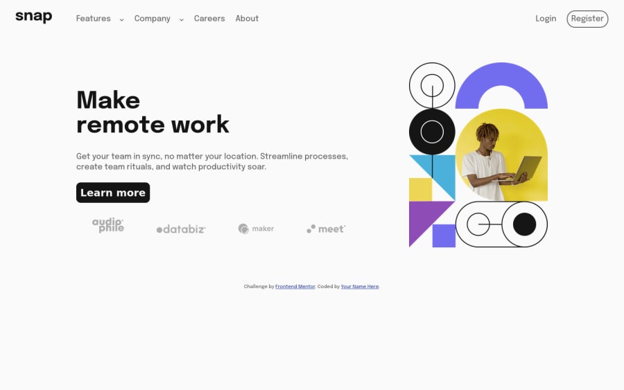
Intro section with dropdown navigation solution
Design comparison
Solution retrospective
Using the HTML <img> element or using the CSS background image What is better for you?
Community feedback
- P@visualdennissPosted about 2 years ago
Great job completing this challenge successfully and making it fully responsive with a working mobile menu! Looks great overall.
One suggestion to improve matching with the given design is add some max-width for the paragraph text, so that the text is not too long on a larger screen sizes.
For example like this:
.description { line-height: 1.3; margin-bottom: 1.5rem; max-width: 500px; }
this will make your description easier to read and match the design even more.
Hope you find this feedback helpful!
Marked as helpful0@ssenyondo67Posted about 2 years ago@visualdenniss thanks again I had never thought that
0 - @0xabdulPosted about 2 years ago
Hello there ! 👋 Congratulations you finished the Intro section with drop down navigation ...🎉
- Some suggestions for you improve your code🤔
- In Css 🎨 :
- well your intro section component is not center aligning🎯 so fix the problems..
body { display : flex; align-item : center; justify-content : center; max-width : 100%; height : 100vh; overflow-x : hidden }- I Hope it's useful for you and wating for your next project ❤️
- Happy Coding 😃
0@ssenyondo67Posted about 2 years ago@0xAbdul thanks much but I used margin auto center the container
0
Please log in to post a comment
Log in with GitHubJoin our Discord community
Join thousands of Frontend Mentor community members taking the challenges, sharing resources, helping each other, and chatting about all things front-end!
Join our Discord
