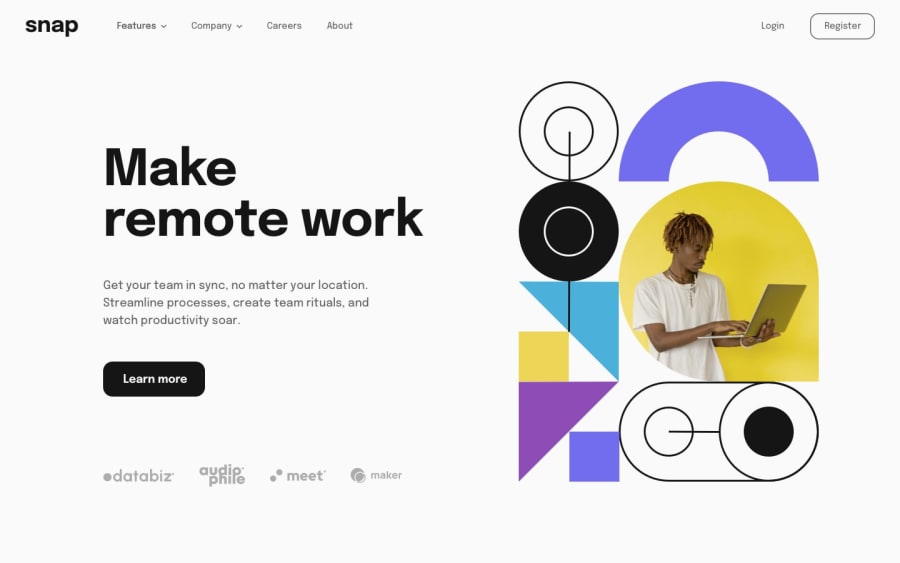
Intro section with dropdown navigation [Redesign]
Design comparison
Solution retrospective
This is my first time doing a loading page. I don't own 100% of the design's originality. I took design references and combined/adapted them from different sources (references listed under my README.md file). I just want to learn how to integrate some of these components/animations into my solution. The hovering transition for the login and register buttons is somehow not very smooth. Not sure if it is because the CSS conflicts with Bootstrap's default settings.
Community feedback
- @WandolePosted over 1 year ago
Hey,
Very nice!
For your problem with the button "Register" on hover: it's because the hover effect remove the border on the button. The border is 2px wide and for that reason the 'login' button shift to the right by 2px...
To fix that, you could keep the border on the hover effect (for the 'Register' button), but change the color to 'transparent' for example!
.btn:hover{
    border: 2px solid transparent; // Or even 'border-color: transparent' is enought I think
}
I hope it helps!
Marked as helpful0 - @Randall3475Posted over 1 year ago
Looking slick! If Snap was a Web3 website. What do you use to create your images? Are you doing it by yourself or perhaps using some kind of AI image generation tool?
0@Jo-cloud85Posted over 1 year agoHi @Randall3475, thank you! The 5 square images were definitely not drawn by me as it would have taken me a lot of time. The focus here was the code after all. I used a simple one-liner prompt on Midjourney to create those images.
0 - @visualdennissPosted over 1 year ago
Looks like a neat job! Unfortunately page does not load for me, the loader is stuck endlessly, saying transferring data.. :/
Judging by the screenshot, i like the gradient you have used, however i think the yellow color in the provided image does not go very well with it, too many tones and colors on a single page. I'd suggest using an alternative image decorated with shapes but with no more than a single color. Also the constrast between paragraph and background seems to be a bit low, as well as nav text having diff color than heading/paragraph makes it look a bit inconsistent.
Keep up with the creative work and experimenting!
0@Jo-cloud85Posted over 1 year agoHi @visualdenniss, thanks again for your recommendations! I am not sure how to solve the issue of the loader. So far, it seems to be working on my phone and desktop...
On the other hand, I understand where you are coming from with regards to the color scheme since I was using a purplish-blue background. I tried using Midjourney to get some images of a similar color theme which I thought was quicker than searching for an alternate image with a similar color scheme. Hope the colors seem a little more coherent now...
0@visualdennissPosted over 1 year ago@Jo-cloud85
Yes, looking much better and consistent now! Good job!
0
Please log in to post a comment
Log in with GitHubJoin our Discord community
Join thousands of Frontend Mentor community members taking the challenges, sharing resources, helping each other, and chatting about all things front-end!
Join our Discord
