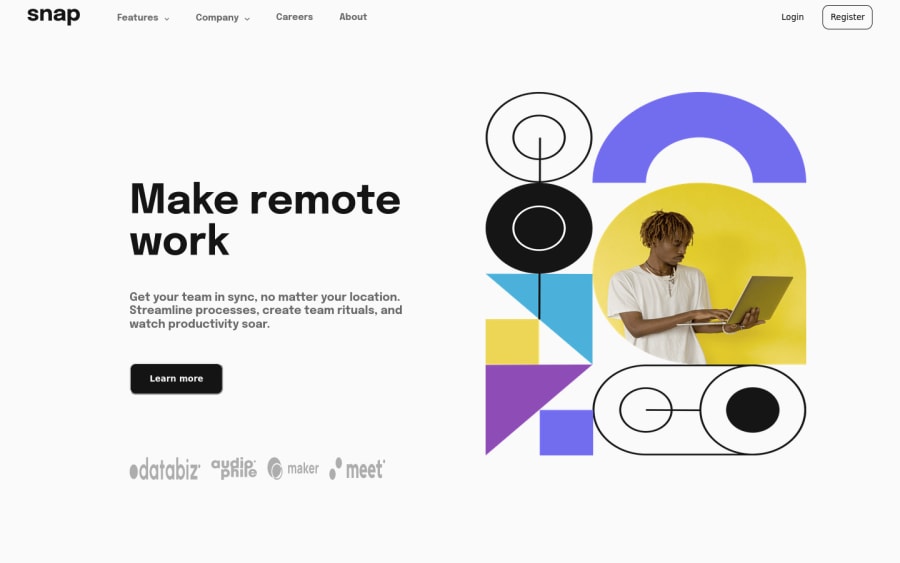
Design comparison
Community feedback
- @sulemaan7070Posted over 1 year ago
hey brspkts😄, great job! here are a few suggestions to make the site better..
1.the images on your site seems stretched or squeezed to fix that you can add the property of
object-fit:contain.img{ object-fit:contain; }to make all the images contained.
2.Make the
.navbarpositioned fixed like this@media (max-width: 712px) .navbar { position: fixed; }3.I see that you have applied only the
desktop-imageon both the desktop and the mobile versions.. you will find the image in theimagesfolder.. you can responsively change the image based on themedia-query..4.Add an overlay in the background when mobile-menu is opened.. more about the overlay here📚
hope that helps, happy coding💯🔥👍🏻
0
Please log in to post a comment
Log in with GitHubJoin our Discord community
Join thousands of Frontend Mentor community members taking the challenges, sharing resources, helping each other, and chatting about all things front-end!
Join our Discord
